ArcBank

UX / UI Designer

Role

Industry & Competitor Research • Brand Identity & Visual Language Design • Sketching & High-fidelity Wireframing • Screen Layouts & UI Composition

Tools

Miro (Research & Analysis) • Paper Sketching & Low-fidelity Prototyping • Figma (Design & Design Library)

Team

Lead UX Designer
Solo project, with Collaborative Feedback during Research & Iteration

Designing Trust with a Human Touch

How can a digital bank feel both trustworthy and human?
This project explores that question by rethinking how visual identity, layout, and interaction design can build confidence, clarity, and ease of use in digital financial products.

Created as part of the Professional Certificate in Product Design (UX/UI) at the UX Design Institute, the challenge was to design the interface for a new, fully responsive digital banking application for a fictional challenger brand. Unlike traditional banks, the goal was to move beyond rigid and corporate aesthetics, creating a UI that feels playful, clear, and trustworthy.

The project focused on three core screens, My Accounts, My Current Account, and Spending, designed across desktop, tablet, and mobile to ensure a consistent and confident experience at every touch point.

Research & Design Direction

To define the direction for ArcBank, I began with a competitive benchmark and heuristic evaluations of banking and fintech apps. This analysis revealed common usability issues such as dense dashboards, reliance on color-coded charts, and limited visual hierarchy.

Alongside this, I created visual moodboards to explore the product brief: designing a banking platform that feels trustworthy, clear, and playful. Inspiration came from both financial apps and graphic design and editorial layouts, where structure and personality coexist.

These insights guided decisions around typography, color, layout, and interaction patterns, forming the foundation of the redesign.

The improvements were evaluated against the initial heuristic findings, focusing on stronger hierarchy, WCAG-compliant color contrast, and clearer data visualization, making financial insights easier to interpret at a glance.

From Problem Discovery to Design Solutions

01. Lack of Human and Approachable Identity

Many traditional banking apps feel cold, rigid, and transactional. Competitive benchmarking revealed a common pattern: muted color palettes, strict layouts, and heavy iconography designed for efficiency but lacking warmth or personality.

Early concepts for ArcBank explored a softer direction, but simply adding warmth risked weakening something essential in financial products, clarity, hierarchy, and trust.

A heuristic evaluation further reinforced this issue. Many interfaces showed weaknesses against usability principles such as aesthetic and minimalist design and recognition rather than recall. Dense typography, repetitive layouts, and minimal emotional cues forced users to process more information while providing little visual guidance or hierarchy.

As a result, the experience can feel intimidating and impersonal. When interfaces lack warmth and clear structure, users must invest more mental effort to navigate them, which can reduce engagement, weaken trust, and make it harder for banks to stand out in a crowded market.

The challenge became clear: design a visual identity that feels human and approachable while still communicating stability, confidence, and usability.

Dense typography, similar visual weights, and problems with spacing, make it difficult to distinguish primary actions, increasing cognitive effort.
Muted palettes and rigid layouts prioritize efficiency but create interfaces that feel impersonal and emotionally distant.

Human-Centered, Balanced Visual Identity

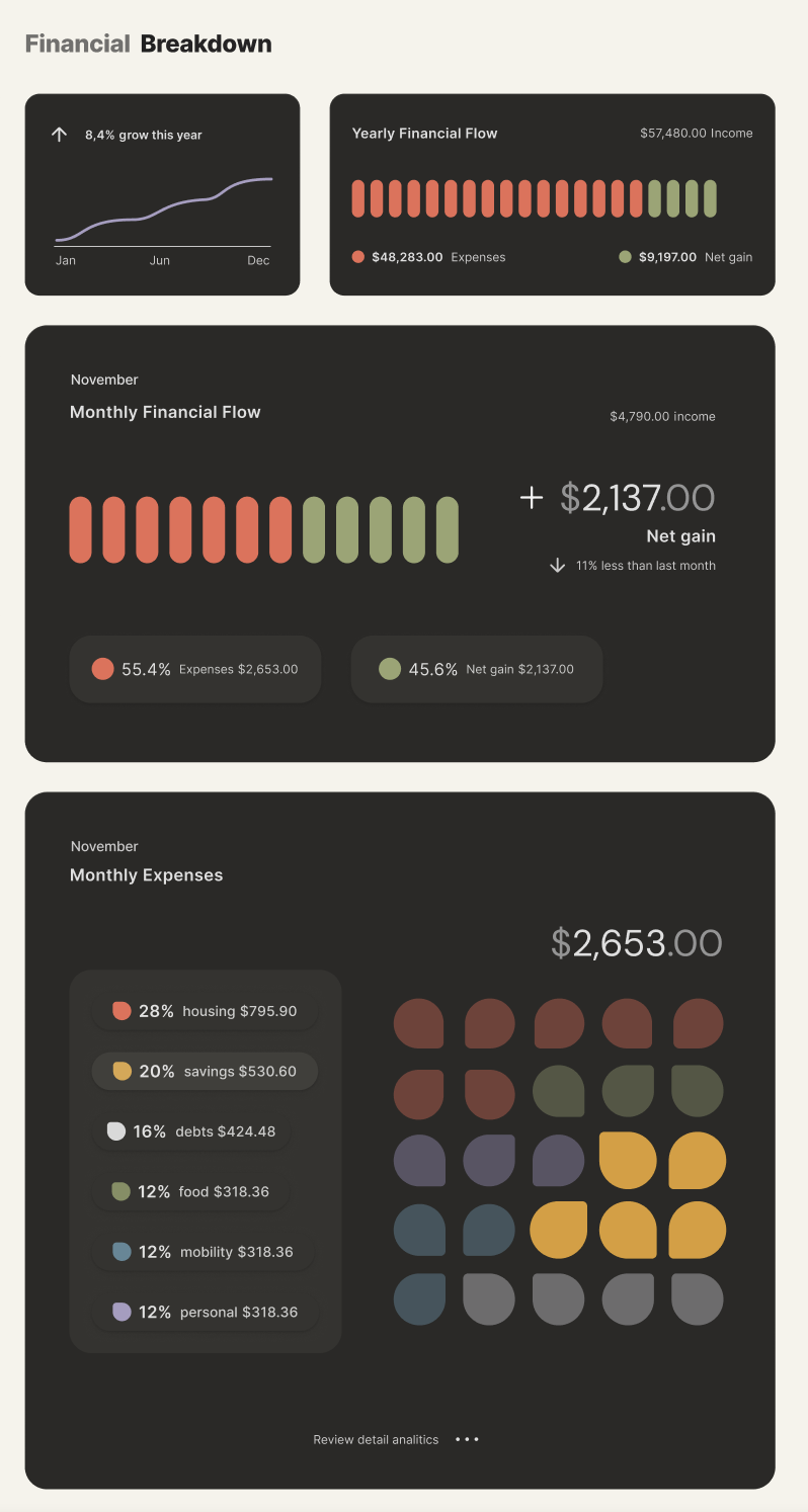
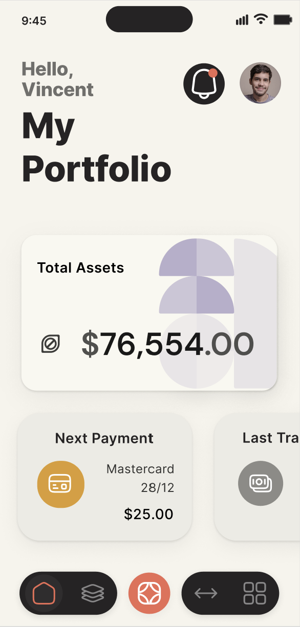
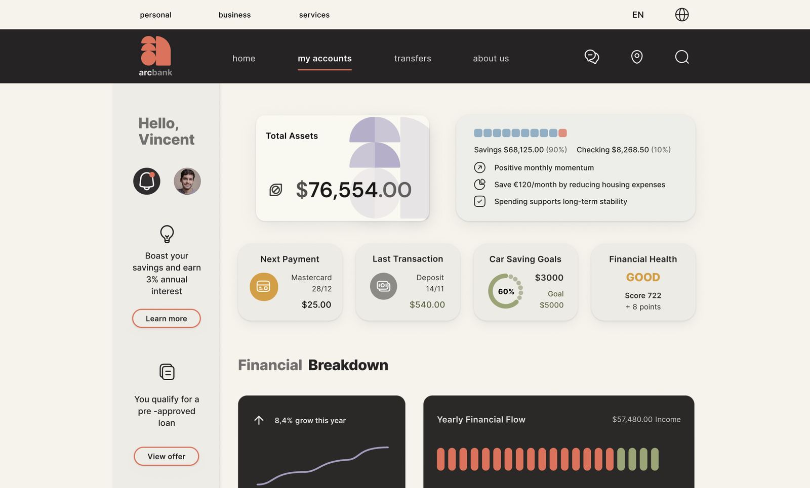
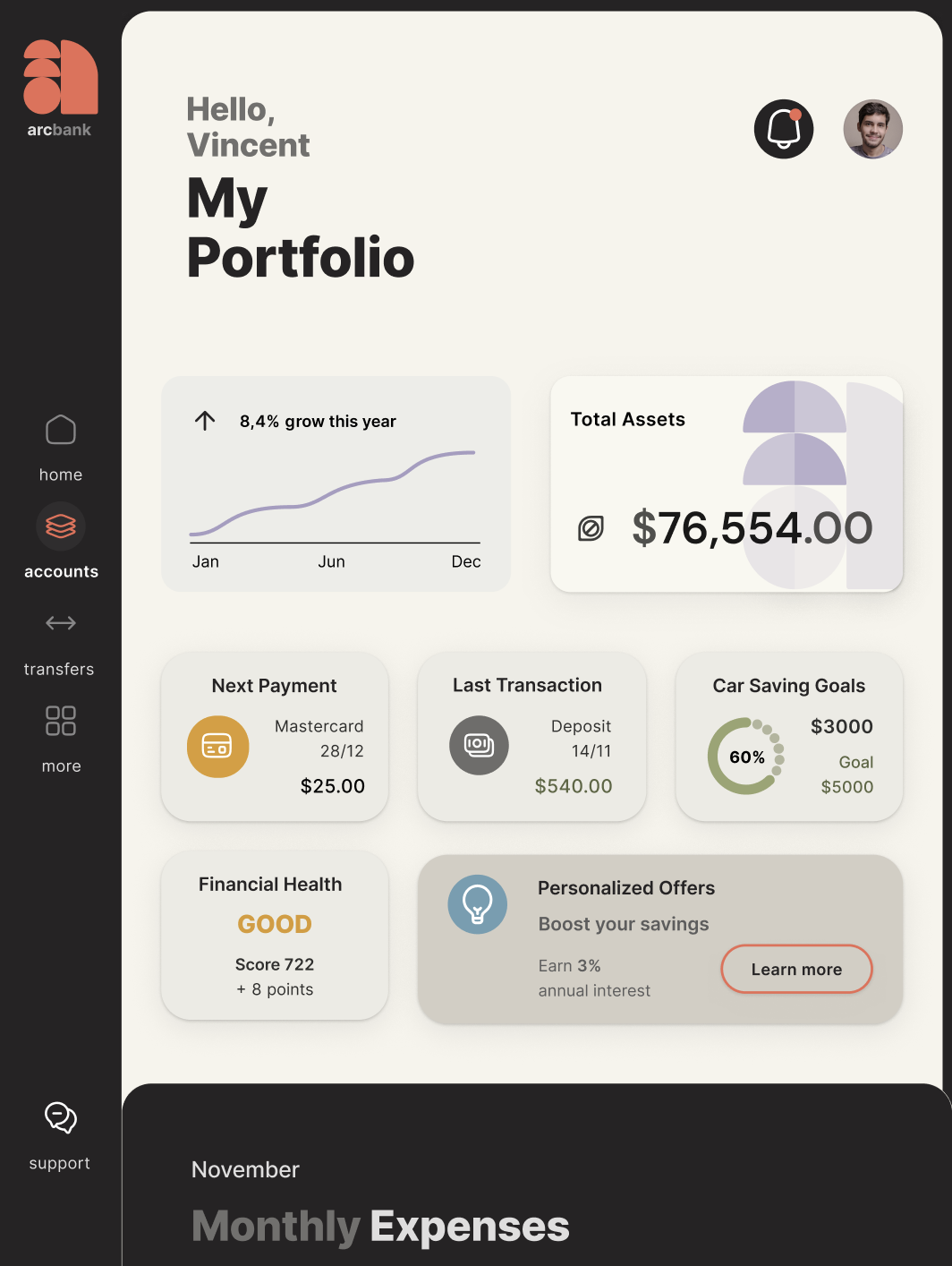
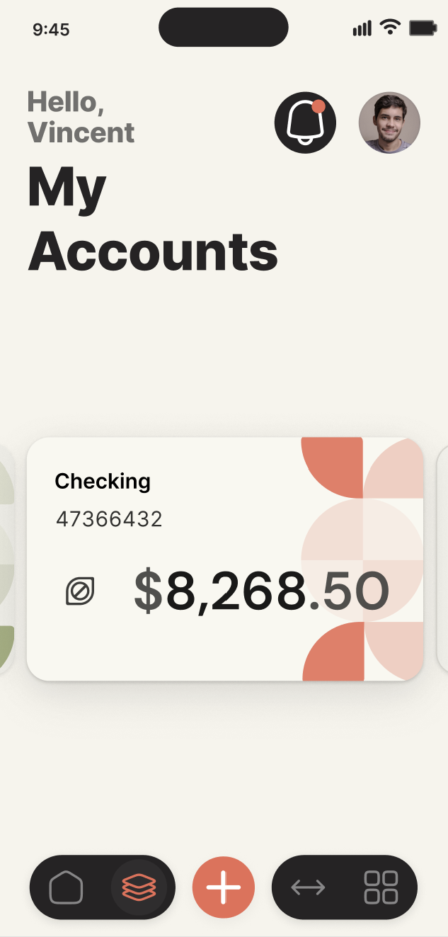
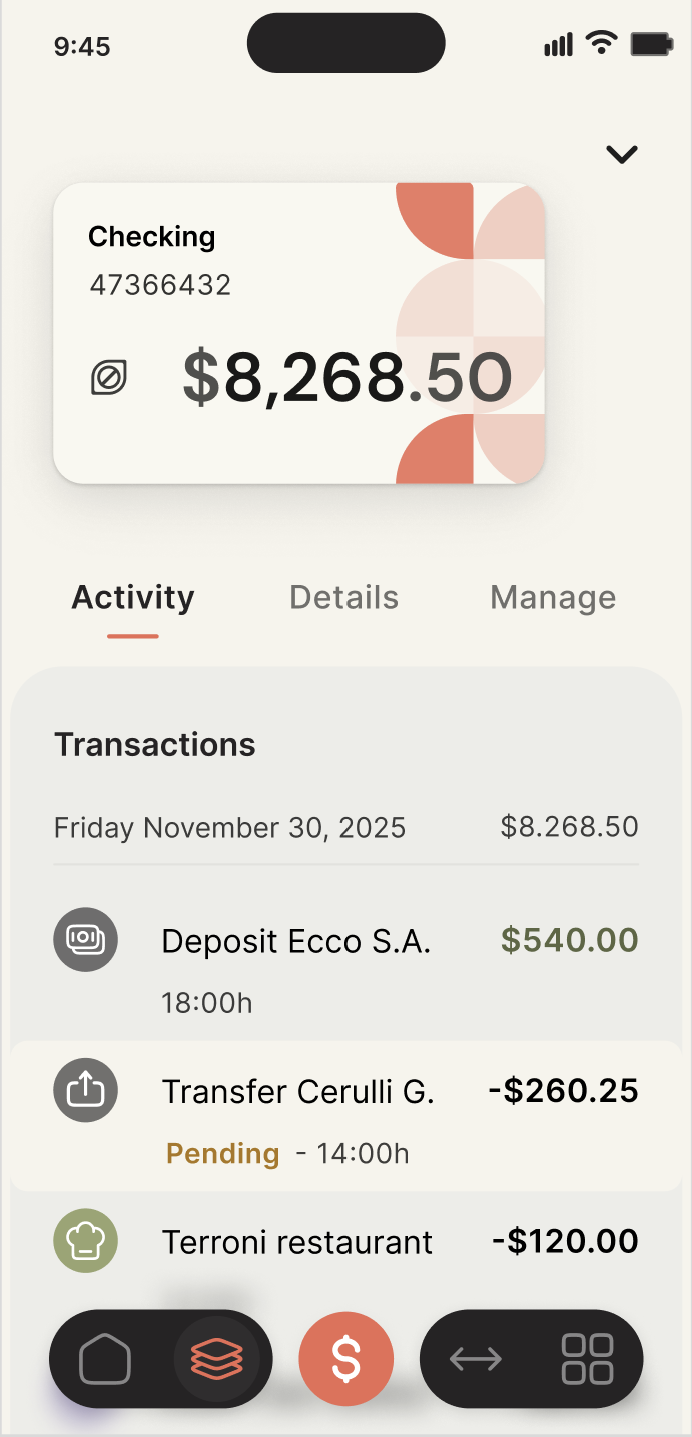
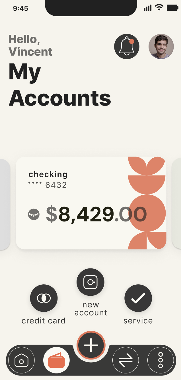
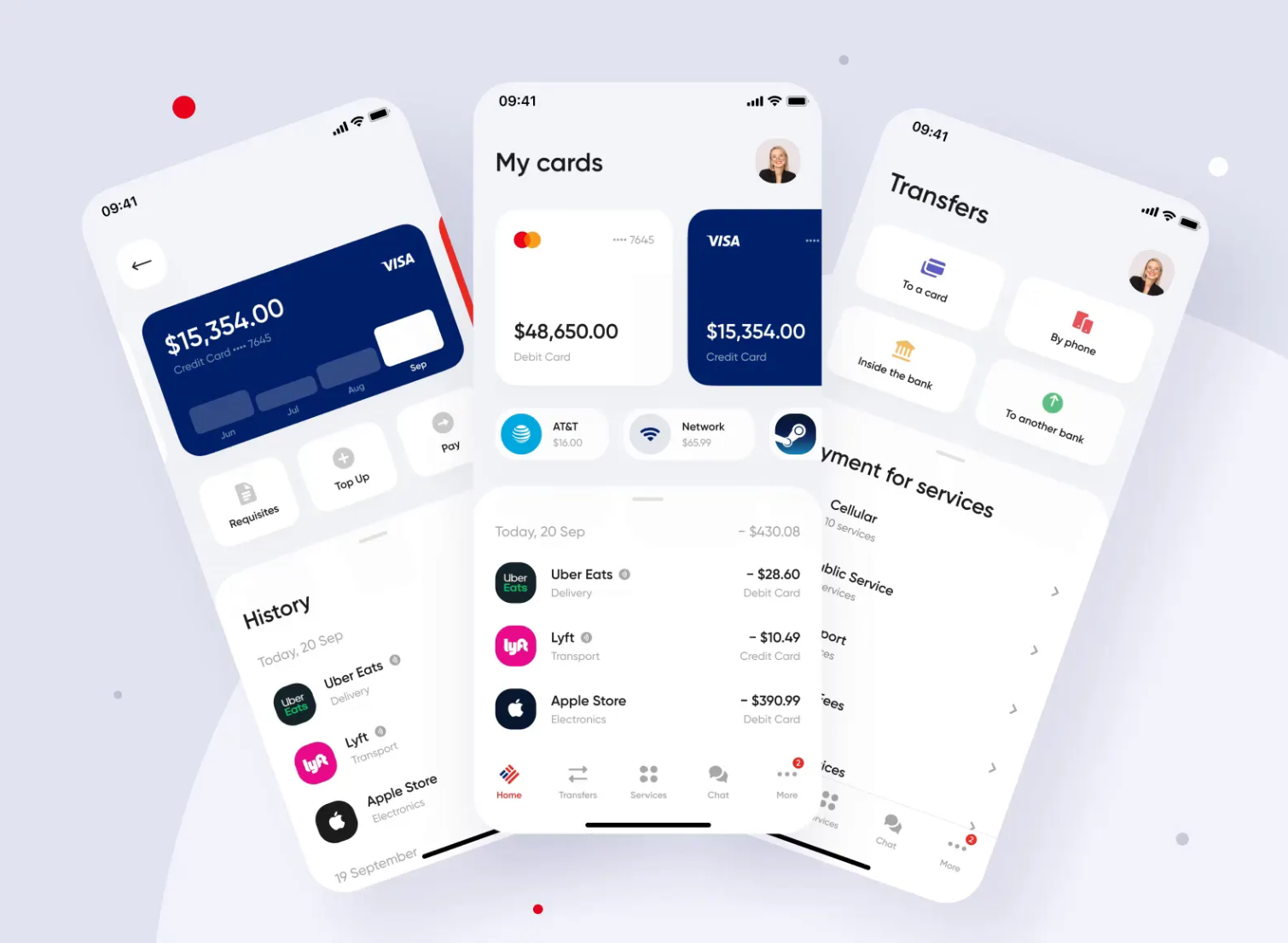
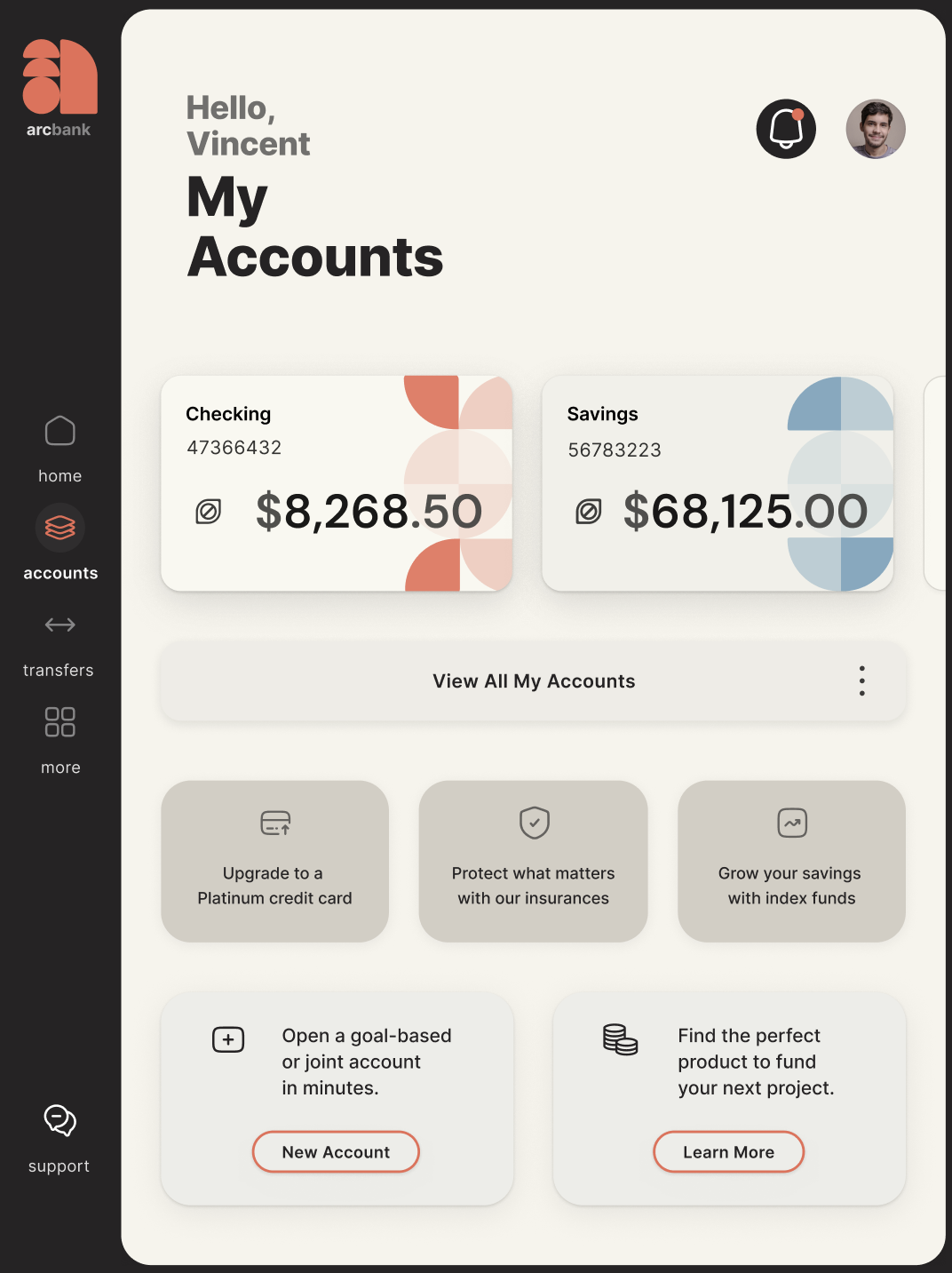
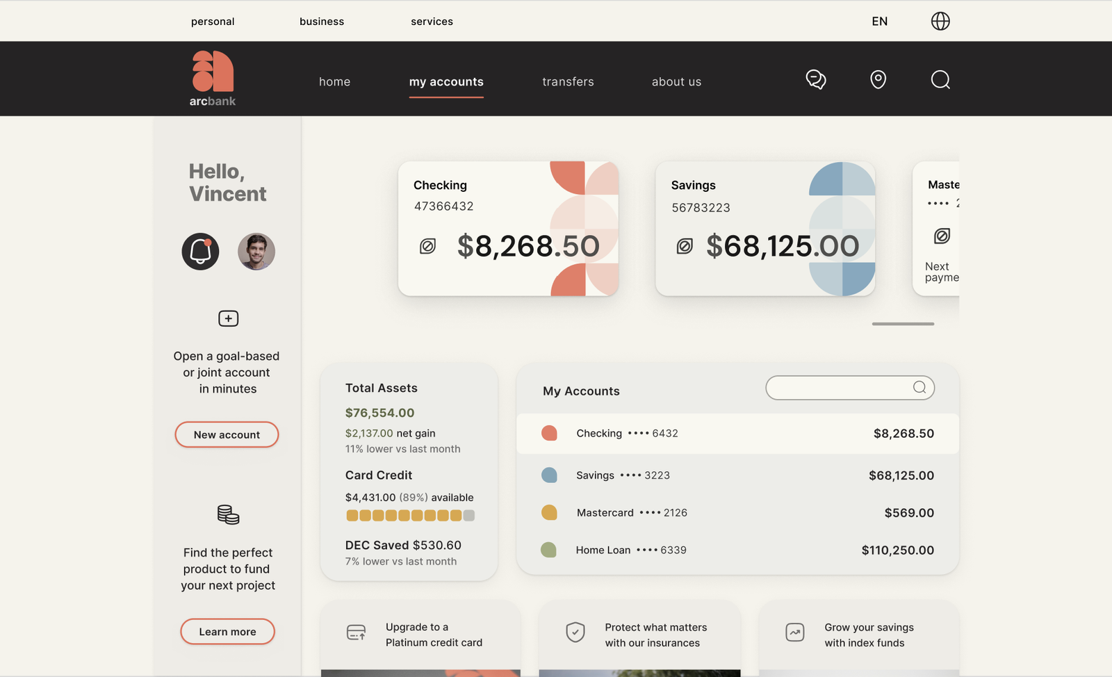
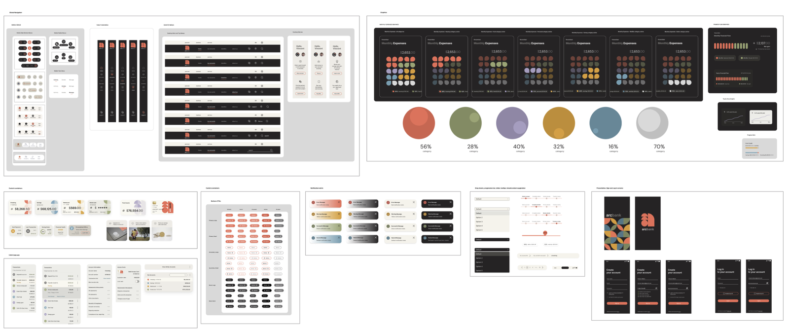
To move away from rigid, impersonal banking interfaces, ArcBank blends organic cues with Bauhaus-inspired structure, creating a visual identity that feels playful, clear, and trustworthy. Curved arcs became the guiding metaphor, shaping the logo, interface elements, and patterns to create consistency, recognition, and visual rhythm across the product.
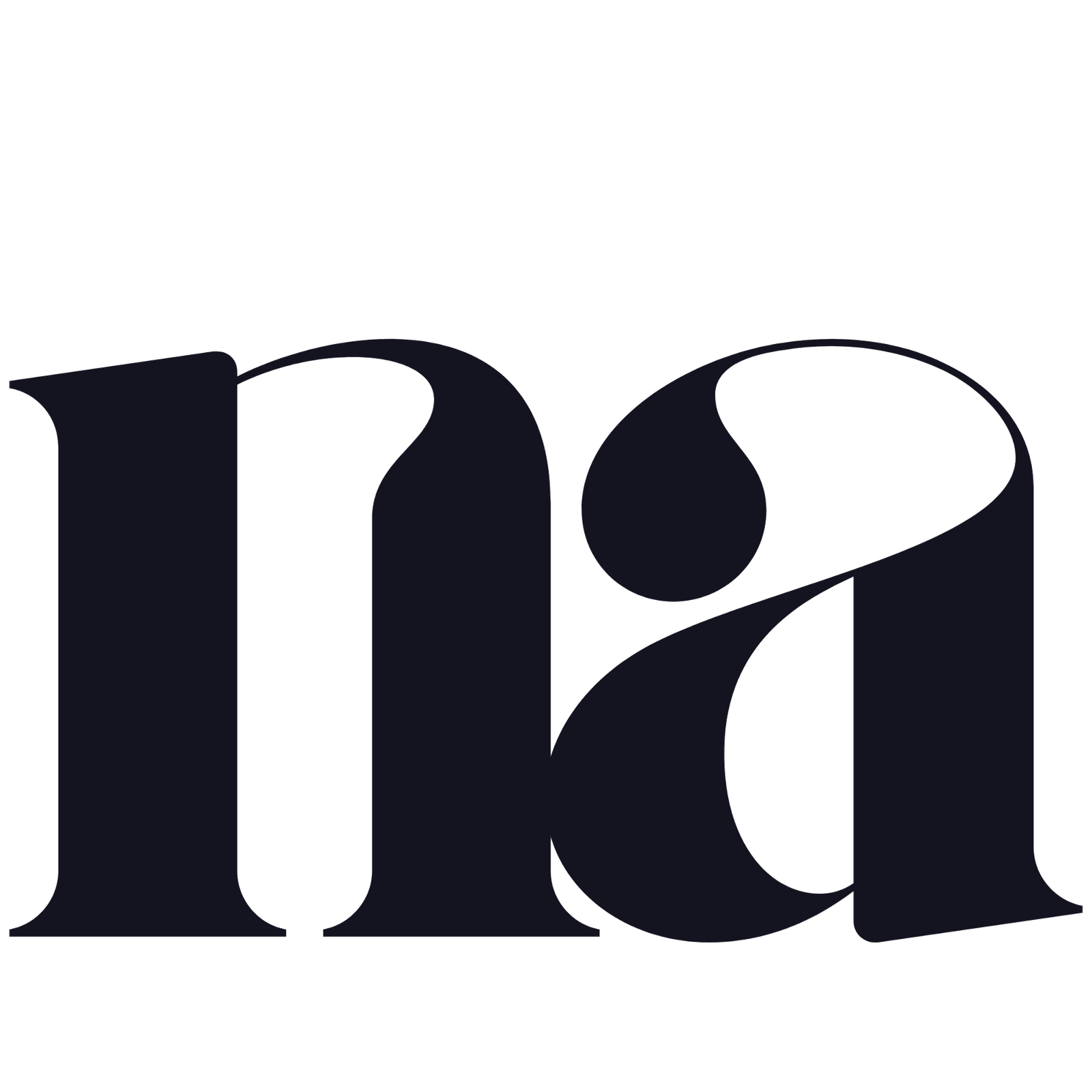
Logo
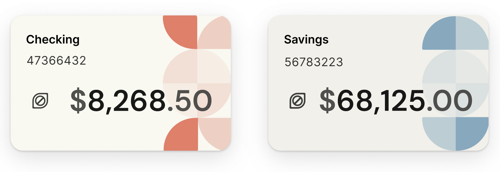
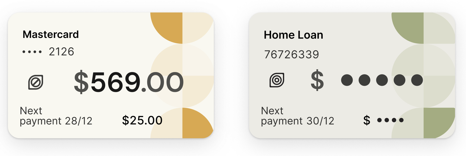
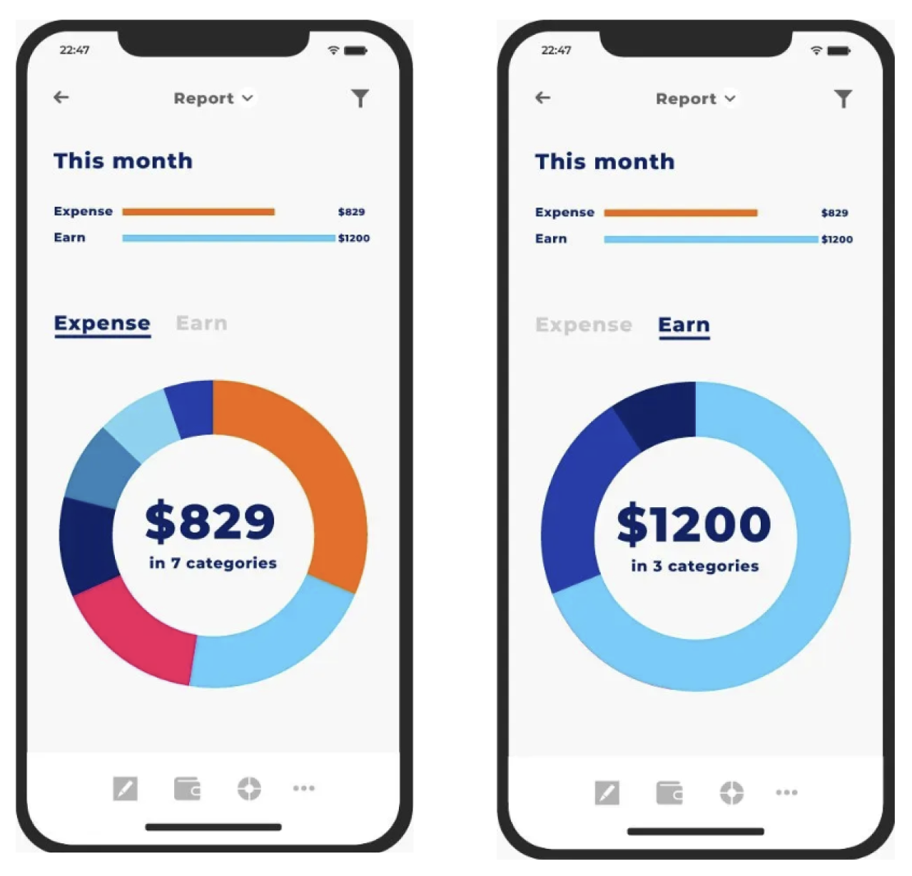
The “a” is built from modular quarter-circle arcs that extend into buttons, icons, and data visualizations, introducing movement and personality, while maintaining clarity.
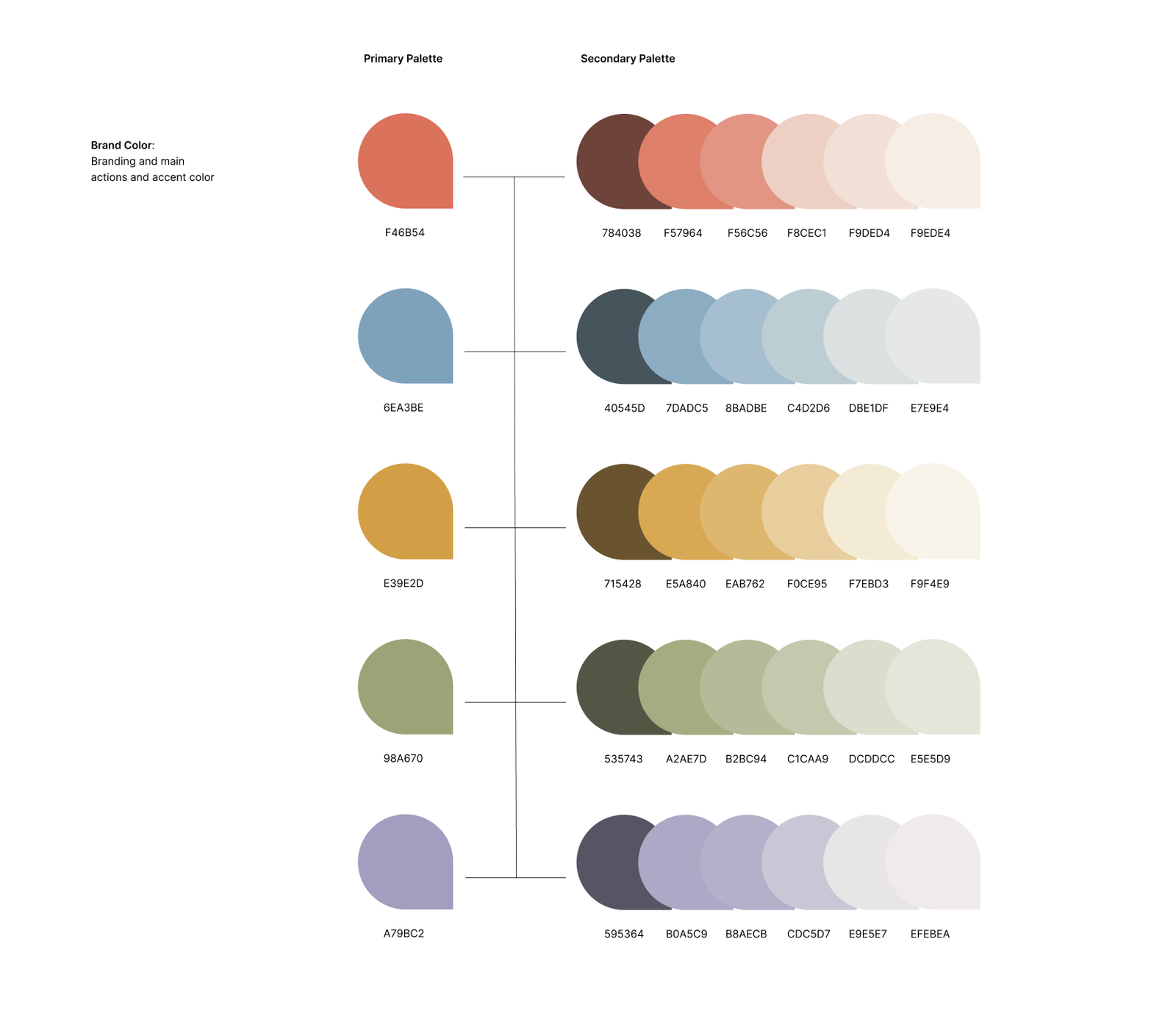
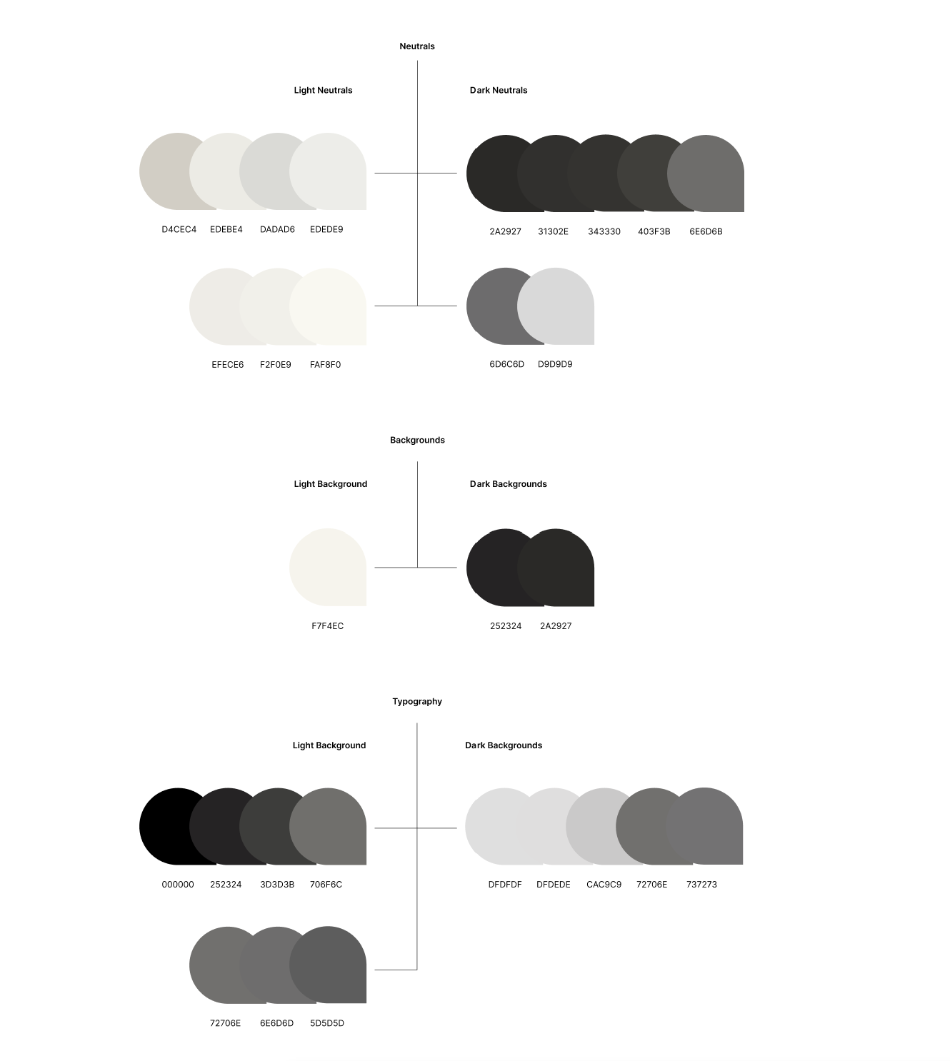
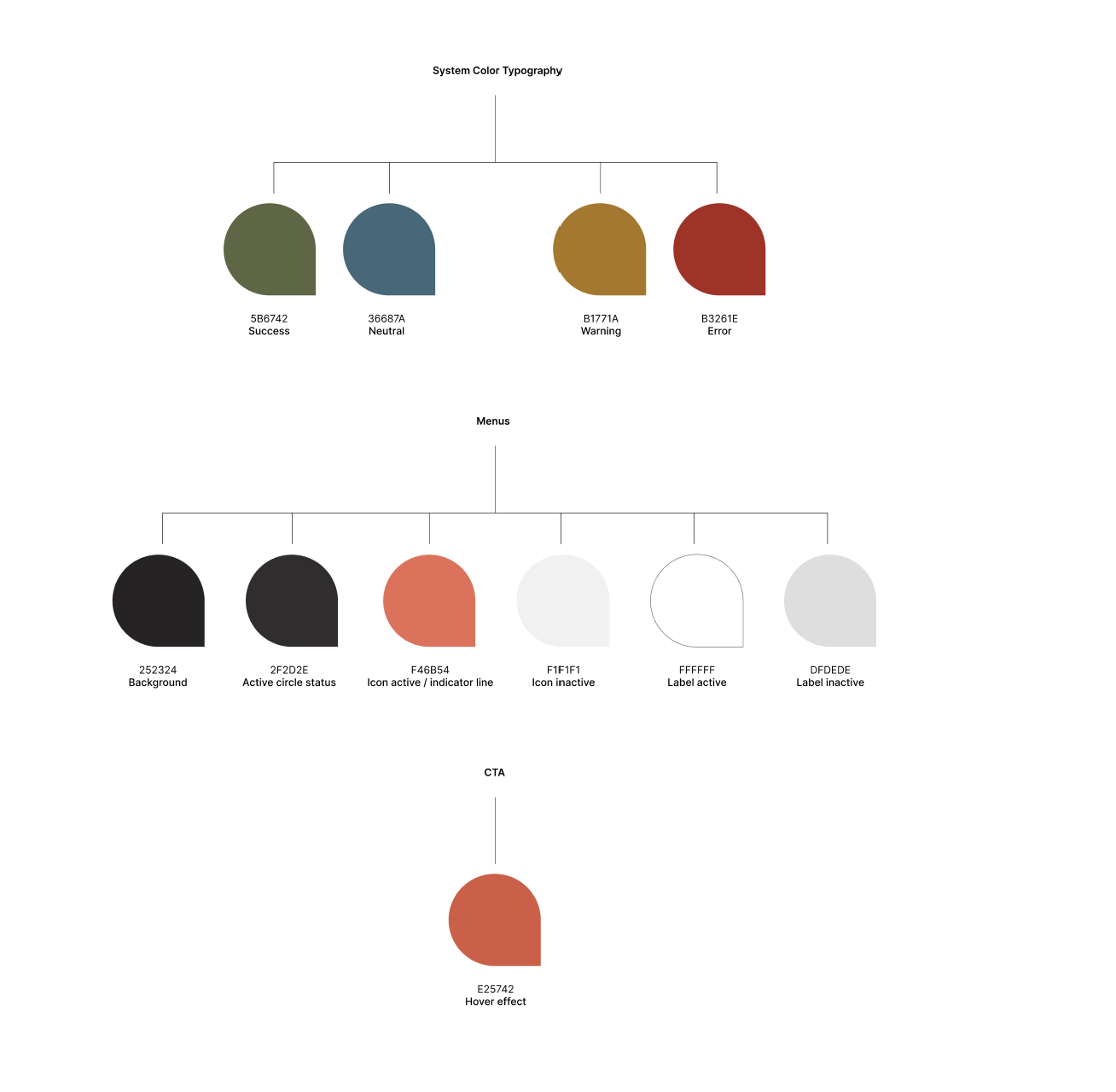
Color
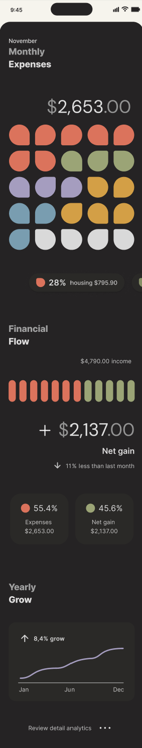
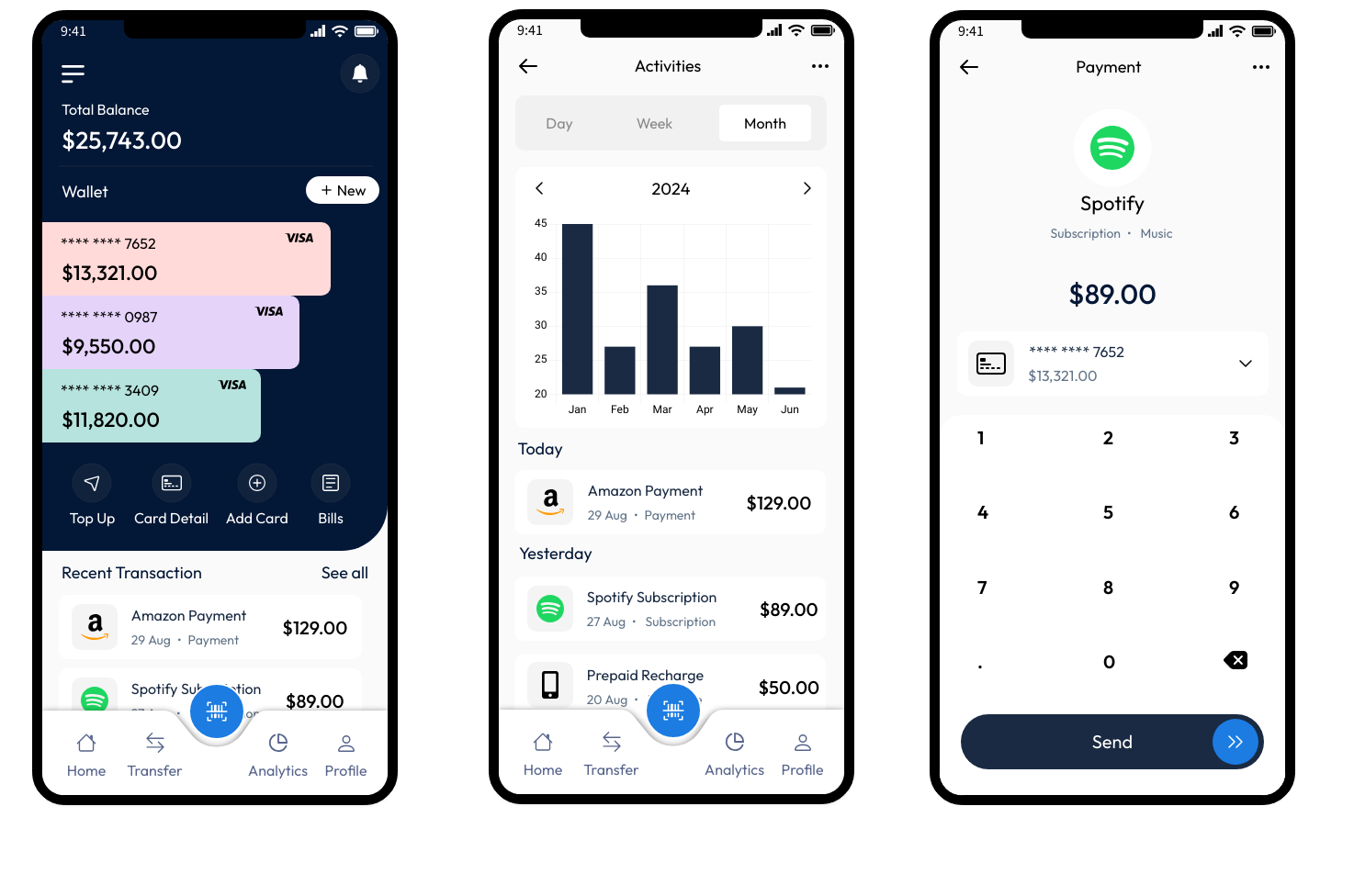
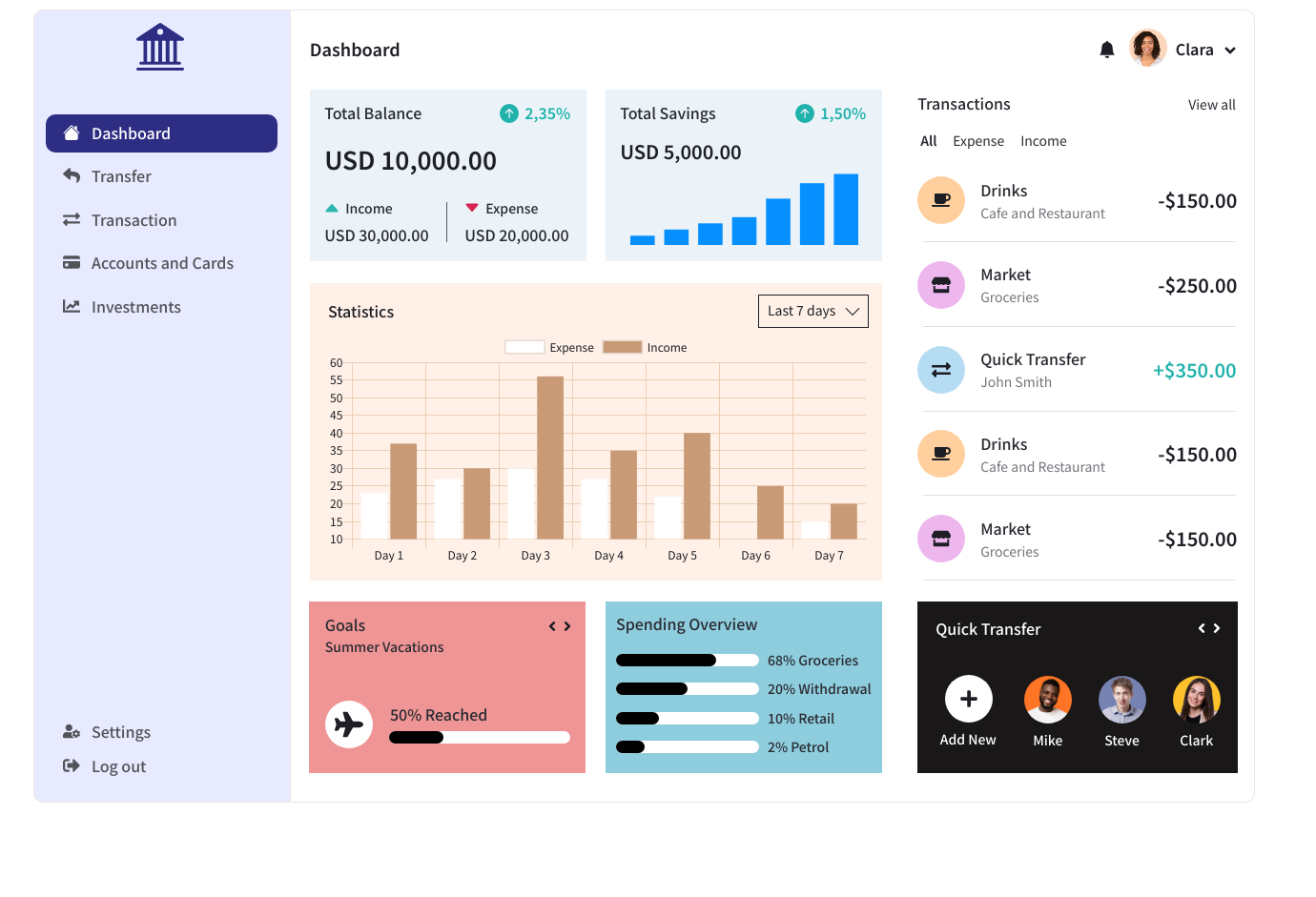
A structured palette is softened with pastels and anchored by a vibrant coral red. Light mode supports everyday actions, while dark mode creates a calmer space for reflection and financial insights.
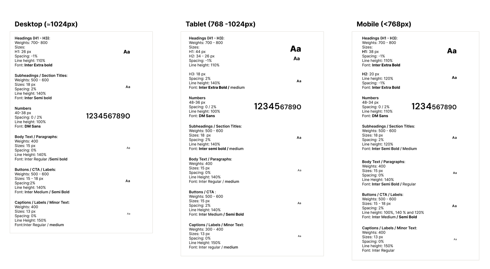
Typography
Inter ensures clarity and readability, with a defined hierarchy that guides attention without feeling rigid.

Iconography
Rounded outline icons reinforce approachability while maintaining clarity and consistency.

Together, these elements create a visual system that feels structured yet human. By guiding attention and reducing cognitive load, the interface transforms financial management into a calm, confident experience.

arcbank logo
arcbank cards
The arc motif extends from the logo into UI components, reinforcing brand recognition while introducing a softer, more human visual language.
arcbank -my accounts - mobile
Light mode prioritizes clarity and readability for daily tasks such as checking balances, managing accounts, and making payments.
A darker interface creates a calmer environment for exploring spending patterns and financial data, helping users shift from action to understanding.

02. Complex Navigation and Information Structure

Early banking apps often overwhelm users with cluttered menus and disconnected account views. In many competitor apps, key actions are hidden in nested menus or long scrolling lists, forcing users to hunt for tasks. Heuristic evaluations also revealed that some screens lacked clear hierarchy, requiring users to mentally map their accounts to understand their finances.

The result is a disjointed experience where users struggle to see the full picture or locate what they need quickly. In ArcBank, the challenge was to design navigation and information architecture that feels natural and predictable, guiding users from the big picture to the details, supporting fast decisions, and reflecting the way people naturally think about money.

Navigation overload
Too many menu items and nested sections make it difficult to quickly locate key actions.
No holistic financial overview
Users must mentally combine balances across accounts instead of seeing their finances at a glance.

Intuitive, User-Centered Information Architecture

The “My Accounts” hub puts all accounts on a single overview page, with each account leading into its own dedicated space. This mirrors how people naturally think about money: first the big picture, then the details.

On mobile, a four-anchor navigation model, Home, Accounts, Transfers, and More, creates a simple, memorable structure. Contextual floating action buttons (FABs) surface the most common actions exactly where they’re needed:

  • Home: access insights and visualizations

  • Accounts: add accounts, financing, and get support

  • Current Account: top-ups, payments, and rewards

Sketching became a design laboratory, testing modular components, playful interactions, and fluid transitions between spaces. These early explorations shaped an information architecture and navigation system that integrates structure, usability, and brand personality.

The result is an interface where users can navigate intuitively, complete tasks faster, and see the full scope of their finances at a glance. Floating actions and the hub layout reduce friction, improve discoverability, and make the experience feel fluid, intentional, and human-centered.

Financial overview hub
Users quickly understand their finances and access insights from one entry point
Clear account hierarchy
Users can scan all accounts at a glance and move naturally from overview to details
Contextual quick actions
Radial actions surface tasks like payments and top-ups exactly where users need them

03. Inconsistent Multi-Platform Experience

Banking apps must adapt to different devices, but without a standardized system these adaptations can create fragmented experiences. Screens, components, and interactions often feel disconnected across desktop, tablet, and mobile. Competitive analysis revealed frequent inconsistencies in layouts, typography, and icon styles, while heuristic evaluation highlighted the absence of reusable components, making consistency and scalability difficult to maintain.

The impact is subtle but significant. As visual patterns change across screens, users struggle to recognize familiar interactions, reducing confidence in the interface. Inconsistent visuals also weaken perceived professionalism and brand credibility. Without a modular system, scaling the product or introducing new features becomes increasingly inefficient.

Fragmented component patterns
Different list styles, separators, and UI modules appear on the same screen, reducing visual cohesion
Multiple visual styles emerging
Without a defined system, icons, shadows and UI elements began to diverge, weakening visual consistency
Inconsistent layout patterns
Accounts, balances, and transactions appear in different formats, making interactions less predictable

Cohesive, Scalable Multi-Platform Design

To solve inconsistencies across devices, I created a design system and component library that ensures clarity, cohesion, and scalability. Every element, from screens to interactions, reflects the ArcBank brand while remaining adaptable for future growth.

The system defines:

  • Color: Primary, secondary, accent, and neutral tones guide hierarchy, navigation, and emotional tone.

  • Typography: Inter provides clarity and readability, with defined weights, hierarchy, and capitalization rules.

  • Iconography: Rounded outline icons maintain approachability, consistency, and clarity.

  • UI Components: Modular buttons, FABs, cards, tables, alerts, and forms, with all states (hover, active, disabled), ensure predictable behavior.

Built in Figma, the library documents grids, spacing, colors, typography, icons, and UI patterns. Components are modular and reusable, supporting desktop, tablet, and mobile, and light/dark modes adapt to user needs for action or reflection.

The result is a consistent, predictable, and confident interface. Users navigate seamlessly across devices, while the system makes design and development faster, scalable, and easier to maintain. Visual identity, hierarchy, and usability remain aligned with brand personality, creating a polished, approachable, and human-centered banking experience.

Consistent layouts across devices
Shared components and typography maintain a recognizable experience across desktop, tablet, and mobile.
Reusable component library
Modular UI elements ensure predictable interactions and consistency across the product.
Structured color system
Defined colors guide hierarchy, navigation, and emotional tone throughout the interface.
Clear typographic hierarchy
A structured type scale improves readability and reinforces information hierarchy.

04. Financial Data is Often Difficult to Interpret

Banking apps rely heavily on charts and financial data, but many interfaces prioritize aesthetics over clarity. Competitive analysis revealed that spending insights are often communicated primarily through color-coded charts or dense dashboards, making them harder to interpret for users with visual impairments or limited financial literacy.

A heuristic review also highlighted a common issue: several interfaces rely on color alone to differentiate categories or trends, with minimal labels or structural cues. When combined with small typography and crowded layouts, this can make financial information difficult to read and interpret quickly.

In a context where users need to understand their finances at a glance, unclear data visualization increases cognitive effort and can reduce confidence in decision-making.

Relies on color alone to show categories
Minimal labels and small text reduce readability
Hard for users with color vision differences to interpret
Dense layout with multiple charts and metrics
Key insights not prioritized visually
Small typography increases cognitive effort
Several metrics visible at once, overwhelming the user
Color-coded data without clear labels
Crowded layout makes trends hard to spot quickly

Designing Accessible and Readable Financial Insights

ArcBank’s financial dashboards transform complex data into insights users can grasp at a glance. Instead of relying solely on color, charts use a combination of color, shape, and labels, making patterns and trends clear for everyone, including users with color-vision differences. All colors were carefully tested to meet WCAG accessibility standards, ensuring readability for a broad range of users.

Thoughtful typography and spacing guide the eye naturally. Clear hierarchies, generous white space, and legible font sizes help users scan information quickly, reducing cognitive load and making financial insights easier to digest.

Dashboards prioritize key insights first, while secondary details remain visible but unobtrusive. Introducing dark mode creates a calmer environment for reflection, helping users focus on understanding their spending patterns without visual strain.

Financial data becomes approachable and actionable. Users can read, compare, and interpret insights confidently, turning what was once a dense report into a clear, structured tool for informed decision-making.

Readable financial insights
Clear typography, spacing, and hierarchy help users quickly interpret financial data.
Accessible data visualization
Charts use color, shape, and labels together so insights remain clear and interpretable.

Design Impact

The ArcBank redesign transforms a traditionally rigid banking interface into a clear, structured, and human-centered experience. A cohesive visual system, intuitive navigation, and accessible data visualization help reduce cognitive load and make financial information easier to understand.

The hub-based navigation and contextual actions allow users to move from overview to detail with minimal friction, while a consistent design system ensures predictable interactions across devices and supports future scalability.

Accessibility was also improved by redesigning financial dashboards to rely on color, labels, and hierarchy rather than color alone, with WCAG-compliant contrast and clearer typography to support readability.

Although the project did not include live user testing, the redesign was evaluated against insights from competitive benchmarking and heuristic reviews of existing banking apps. The final interface directly addresses common usability issues such as dense layouts, weak hierarchy, and inaccessible charts, resulting in a banking experience that feels more approachable, understandable, and trustworthy.

Brand Alignment with
Core Values
Custom Design System
Across Devices
Clear & Intuitive Data
Visualization

Takeaways

ArcBank taught me that strong digital products are built not just from screens, but from clarity, intention, and systems. From early sketches to a structured design library, each stage shaped both the interface and the thinking behind it.

This project reinforced how intuitive experiences emerge when research, branding, and interaction design evolve together. Iteration bridged the gap between concept and reality, while the design system ensured consistency and scalability.

Working on ArcBank deepened my interest in data visualization, accessibility, and system design. Structuring financial information clearly and designing inclusive interactions became some of the most rewarding parts of the process.

Ultimately, the project showed me how a thoughtful design process can transform ideas into experiences people can understand, trust, and use with confidence.

MORE PROJECTS

Oris Airways

A More Effortless
Way to Book a Flight

TERRAMYSTICA ADVENTURES

Redesigning Outdoor
Discovery and Booking