Terramystica
Adventures
UX Designer & Content Creator
Role
User Research & Analysis • User Flows, Information Architecture & Navigation • Sketching & Content Creator
Tools
Miro (Research & Analysis) • Paper Sketching & Low-fidelity Prototyping
Team
Lead UX Designer
Solo Project
Setting the Scene
Terramystica Adventures is an outdoor sports company based in Bovec, Slovenia, offering rafting, kayaking, canyoning, and other adventure experiences in one of Europe’s most iconic natural landscapes.
Although the company already had a website, its digital presence did not reflect the quality, professionalism, or energy of the experiences they delivered.
The goal of the project was to transform the website into a discoverable, conversion-driven platform that better showcased the activities, communicated the value of outdoor sports, and highlighted the company’s commitment to nature.
The redesign focused on guiding visitors from exploration to booking, improving usability, engagement, and direct reservations.
Key Pain Points Identified Through Research
User interviews, competitor analysis, and Google Analytics revealed several usability issues that limited the website’s ability to support engagement and bookings. The main challenges included confusing navigation, weak information architecture, and activities that were not clearly explained. The site was also not optimized for mobile, limiting accessibility for users exploring activities on the go.
Based on these insights, I defined three key usability factors, clarity of information, ease of navigation, and booking transparency, and asked participants to rate the existing website on a 1–7 scale, along with their overall satisfaction. I calculated median ratings to establish a baseline and measure improvements after the redesign.
These findings revealed four core UX problems that guided the redesign.
Design Constraints
The redesign was developed within several predefined constraints. Stakeholders required the use of an existing WordPress theme and a third-party payment provider for bookings. In addition, the overall layout direction, including horizontal scrolling sections, had already been decided.
The challenge was to improve usability, clarity, and booking conversion while respecting these technical and structural limitations. This required careful planning to ensure the layout remained clear and scannable, even within the horizontal scrolling format, and that key content and navigation remained accessible and intuitive for users.
Insights & Decisions
01. Limited Activity Discovery
When visitors arrived on the website, the homepage presented a mix of activities, images, and information, but without a clear structure. The top navigation menu was the only path, creating a rigid discovery flow.
User interviews showed that people searched in different ways: some knew exactly what activity they wanted, others looked by location, and some prioritized difficulty, seeking family-friendly or high-adrenaline experiences.
Because the site supported only one path, exploration felt restrictive. Participants rated navigation ease 4.3/7 and often expressed frustration when trying to browse according to their preferences.
The result: activity discovery was non-intuitive, adding friction at the very start of the user journey.
Creating Multiple Paths to Explore Activities
Previously, visitors could only use the top menu, limiting how they discovered activities. Now, the homepage serves as a clear, structured entry point that lets users explore in the way that makes sense to them.
Users can browse by activity type, location, or difficulty level, or use the global search if they already know what they want. Each path reflects how people naturally look for experiences, giving them flexibility and control.
After the redesign, users rated navigation ease 6.2/7, up from 3/7. Participants reported that exploring the website felt intuitive, enjoyable, and much easier, turning discovery from a frustrating task into a smooth, guided journey.
02. Navigation Not Visible at a Glance
Users faced long, flat menus where all activities were grouped together. In addition, the vertical layout meant not all options were visible at once, especially on smaller screens, forcing explorers to scroll and search visually for what they needed.
As a result, users struggled to grasp the full site structure quickly. Scannability suffered, exploration felt slower, and finding the right activity required extra effort, creating friction early in the browsing experience.
Redesigning the Menu for Better Visibility & Understanding
Activities are now organized into hierarchical groups by type, top-level categories like Rafting, Kayaking, and Canyoning clearly show related experiences beneath them, such as Action Rafting and Family Rafting.
The navigation menu was redesigned using six square blocks, Home, Activities, About Us, Bar, Gallery, and Contact, so all main options are visible at a glance, no matter the screen size.
This new structure lets users instantly understand the website’s scope, improves scannability, and keeps exploration intuitive. Visitors can quickly orient themselves, locate activities, and navigate with confidence.
03. Lack of Essential Information for Booking Decisions
When users explored the website, they often hit a wall. They wanted to know what to bring, how long the activity would last, the schedule, prices, and course structure, but this information was missing, buried, or scattered across pages.
Analytics confirmed the struggle: visitors spent only ~18 seconds per page and frequently switched between pages, clearly hunting for details they couldn’t easily find. Frustration grew. Many felt unsure about booking and ended up calling the company to confirm basic information.
This uncertainty created friction, slowed bookings, and chipped away at trust. The website, instead of guiding users confidently to book, left them hesitant.
Designing Clear & Complete Activity Information
To help users confidently book activities, the activity pages were redesigned to provide clear, complete, and scannable information.
Using a horizontal scrolling layout, visuals were prioritized over text to make the pages intuitive and engaging, while still presenting key details:
Duration and schedule
Step-by-step process
Required equipment or items to bring
Price and inclusions
Detailed program for courses
Information was grouped into sections with visual summaries, letting users quickly grasp essentials and compare options at a glance.
After the redesign, users felt more confident, needed fewer calls to clarify details, and found the site easier to navigate. Ratings for clarity jumped from 3.7/7 to 6.7/7, signaling a major improvement in transparency and understanding.
04. Users Could Not Book Nor Pay Experiences Online
Visitors could browse activities but couldn’t reserve or pay online. To book, they had to call and arrange payment in person or via bank transfer.
For travelers relying on cards, this was frustrating. Credit cards were rarely accepted locally, meaning many had to prepare cash in advance. The booking process felt slow, cumbersome, and uncertain.
These obstacles created friction: extra steps, delayed confirmations, and a lack of trust in the website’s reliability. Users often hesitated to book, unsure if the process would go smoothly.
Friction in the Process
"It's a pity that you can not book your adventure online."
Participant 6 - Interview
Trust & Retention Risk
"If I need to work for it too hard, I will go somewhere else."
Participant 1 - Interview
Enabling Online Booking and Secure Card Payments
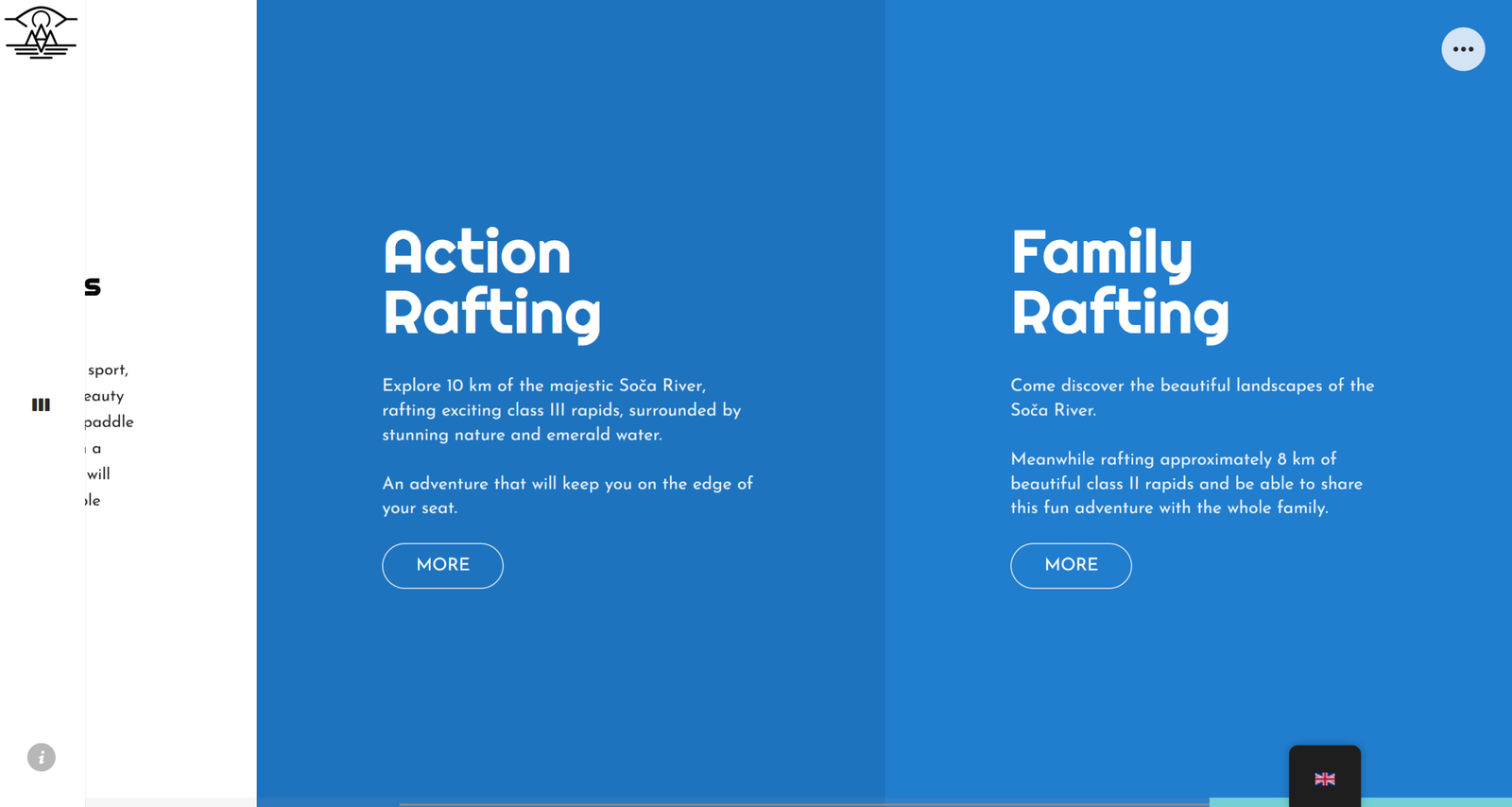
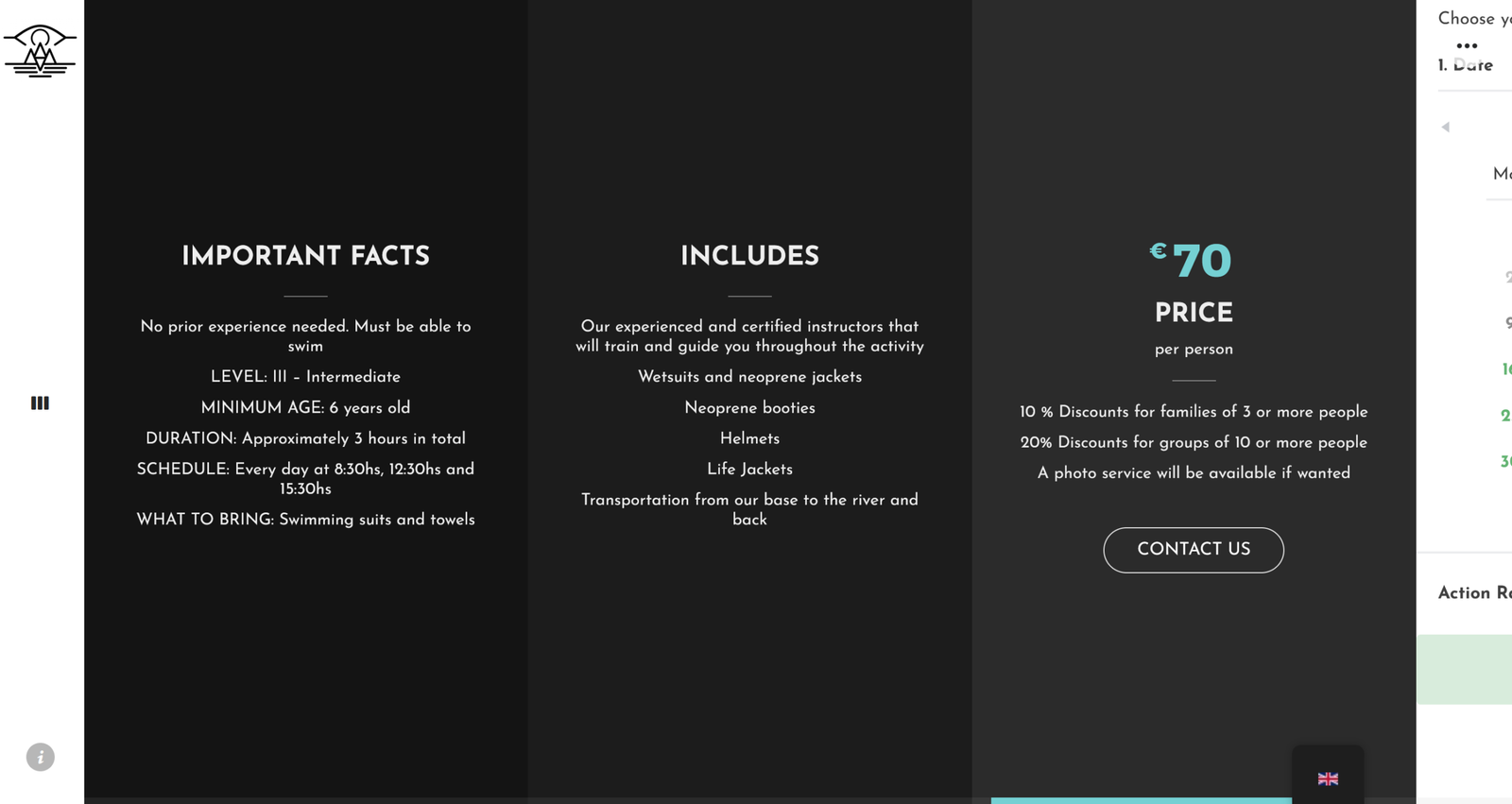
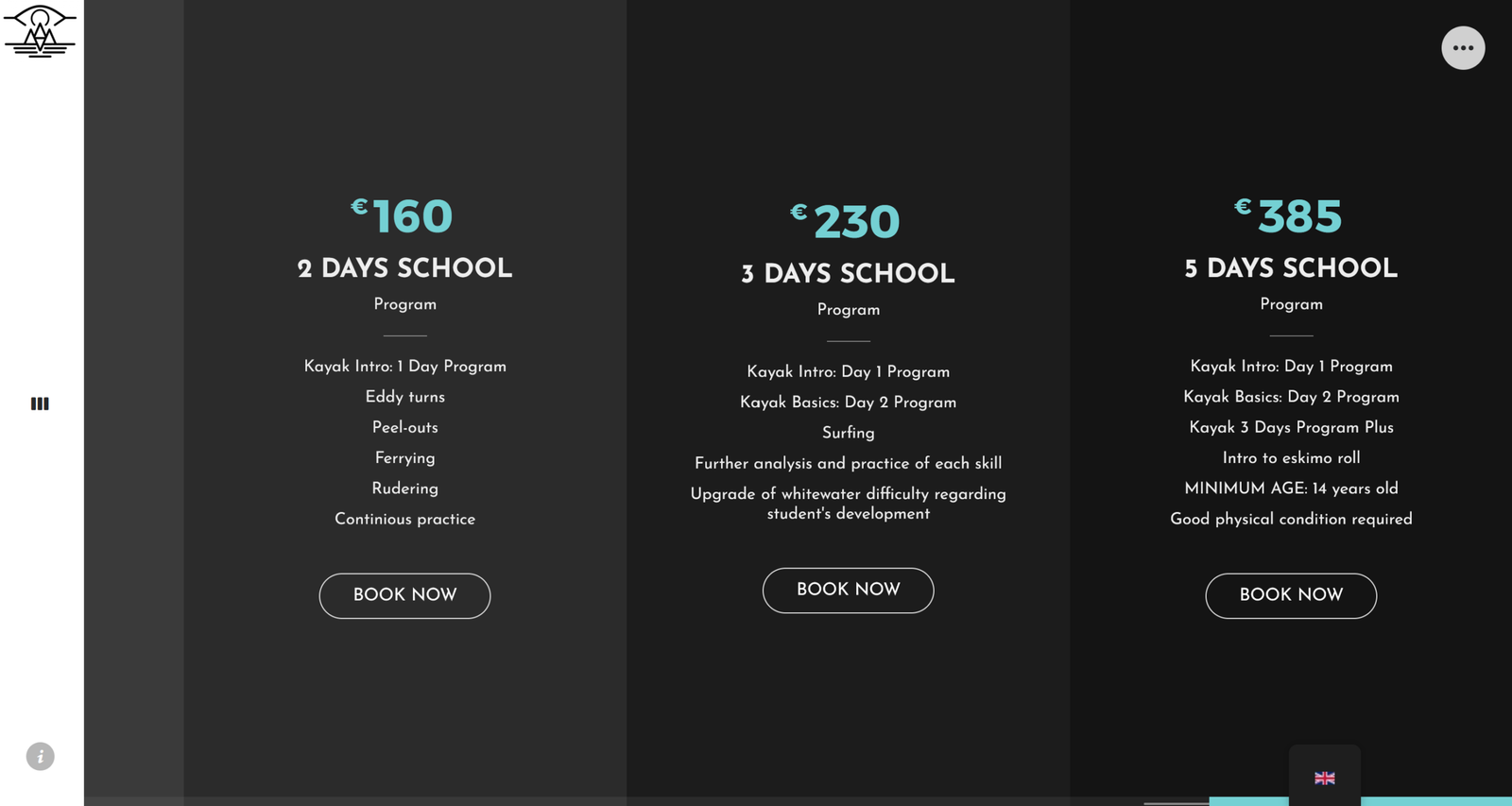
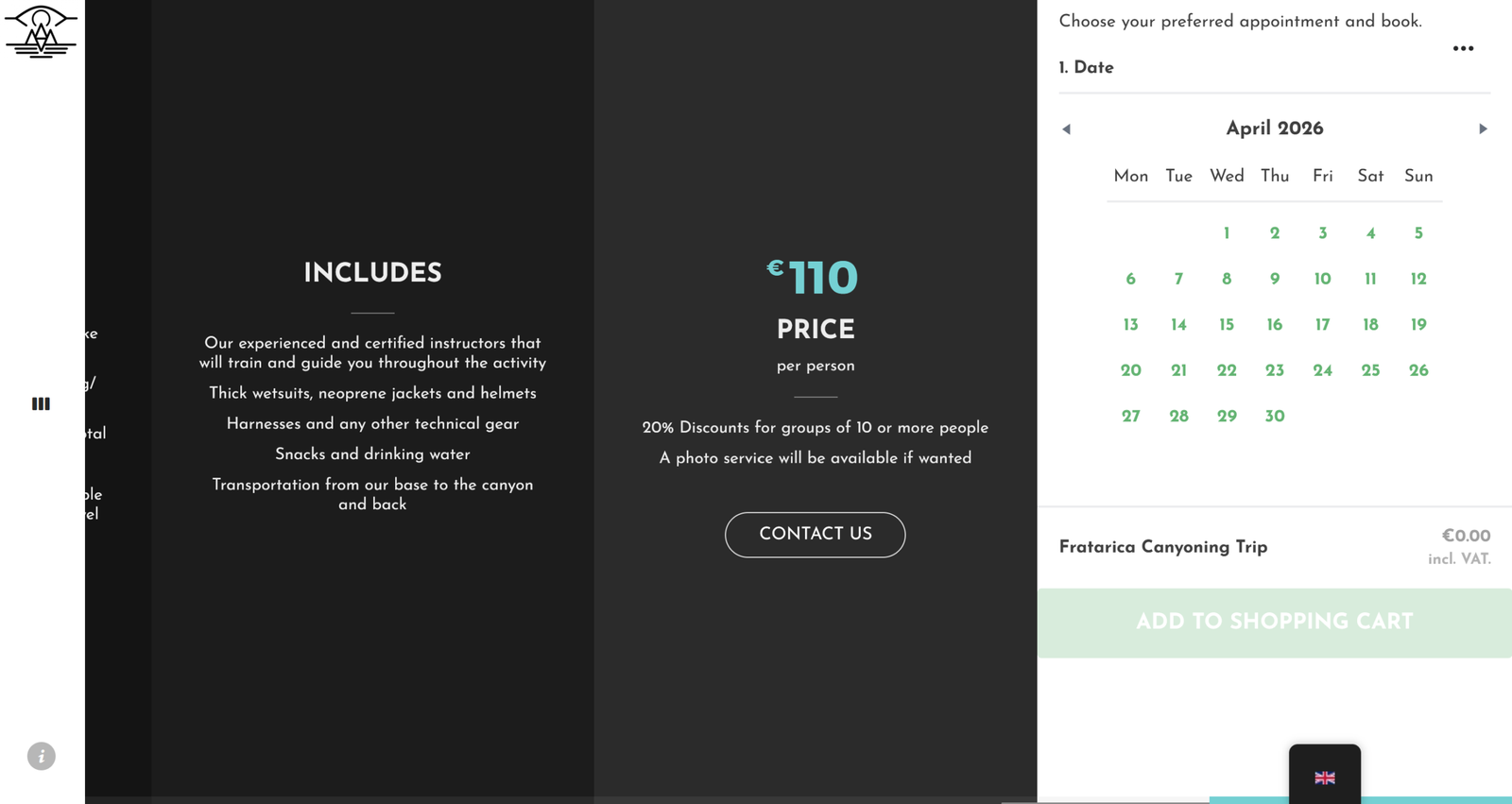
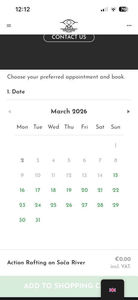
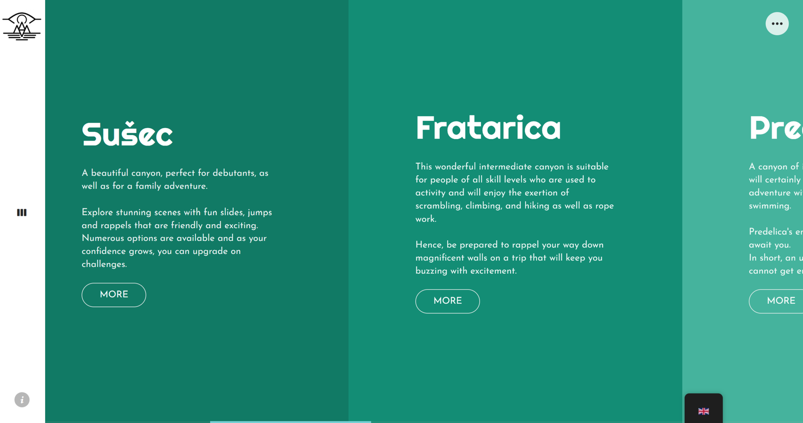
Imagine a visitor excited about an activity but unsure how to secure it. Before, they would have had to call and manage payment manually. Now, they can book and pay directly online.
A third-party booking platform was embedded into the activity pages, creating a seamless flow. The user selects the activity, chooses a date and time, confirms participants, and completes payment, all without leaving the site.
The booking interface fits naturally into the browsing experience, so moving from discovery to reservation feels effortless. Users can now explore, evaluate, and book activities in one smooth journey, enjoying the convenience of secure card payments instead of relying on cash.
The results speak for themselves: website bookings rose by 13%, showing a clear improvement in usability, confidence, and conversion.
Booking and payment services were integrated to work naturally within the existing interface
05. The Website Lacked a Coherent Visual System
Users navigating the website often struggled to make sense of the content. The platform lacked a consistent visual system, so interface elements appeared scattered and unclear, making it difficult to distinguish activity categories or understand content hierarchy.
Interviews and interface reviews revealed that users relied heavily on images to grasp activities, while the surrounding interface offered little guidance. Without a clear visual system:
Activity categories were hard to differentiate
Information hierarchy and scannability suffered
The brand’s adventurous identity was not clearly communicated
The inconsistent visuals created confusion, slowing users’ ability to explore and compare experiences effectively.
Creating a Cohesive Visual System
A visitor lands on the activity page, ready to explore, but previously struggled to distinguish categories or understand the layout. With the redesigned visual system, everything is instantly clearer.
Black and white form the interface’s backbone, while a secondary palette inspired by the Soča River highlights each activity category with distinct colors and tones. Headings in Righteous convey the brand’s adventurous energy, body text in Josefin Sans is easy to read, and numbers in Montserrat clearly show prices, schedules, and key details.
Now, users can scan and navigate activities effortlessly. Categories are immediately recognizable, hierarchy is clear, and the brand’s adventurous identity shines, transforming exploration from confusing to intuitive.
The Impact
The redesign delivered measurable results and transformed the user experience. Direct online bookings rose by 13%, a significant shift in an industry where most reservations traditionally go through partner campsites or accommodations. This growth eased pressure on customer support, strengthened direct conversion channels, and validated the effectiveness of the new digital experience.
Overall user satisfaction increased from 4.8/7 to 6.2/7. Participants highlighted improved clarity, visual hierarchy, and ease of activity discovery as the most impactful changes.
Beyond the core activities, new sections for the company’s bar and catering services enriched the platform, offering a more complete experience. Post-launch, ongoing content updates, SEO improvements, and structural refinements ensured the site remained functional, discoverable, and aligned with business growth.
Product Discoverability
Via Website Booking
User Satisfaction
Takeaways
This project reinforced that research is more than collecting data, it’s a framework for understanding users. Defining clear usability factors early made each test, observation, and iteration actionable.
Working independently within constraints, an existing theme, third-party booking integration, and horizontal scrolling, taught me to balance user needs with business goals and be creative within limits.
Preserving my sketches and paper prototypes was essential for tracking design evolution, reflecting on decisions, and building solutions grounded in research, even without old website assets.
MORE PROJECTS
