Oris Airways
UX / UI Designer
Role
User Research & Analysis • User Flows, Information Architecture & Navigation • Sketching & Wireframing • Interaction Design & Prototyping
Tools
Miro (Research & Analysis) • Paper Sketching & Low-fidelity Prototyping • Figma (Design & Mid-fidelity Prototyping)
Team
Lead UX Designer
Solo Project, with Collaborative Feedback during Research & Iteration
A Calmer, Clearer Journey
What if booking a flight could feel effortless and stress-free? This project re-imagines the end-to-end experience for Oris Airways, a fictional challenger airline, turning booking into a guided, clear, and calm journey.
Completed as part of the Professional Certificate in Product Design (UX/UI) at the UX Design Institute, the case study covers research, pain points, flow and structure design, and a mid-fidelity prototype with annotated wireframes.
The result: a user-centered redesign that transforms flight booking from a stressful task into a confident, intuitive experience.
Insights Shaped by Real Users
To ground the design in real behavior, research combined usability testing, interviews, surveys, competitive benchmarks, and heuristic evaluations. Each method added depth, ensuring decisions were evidence-based.
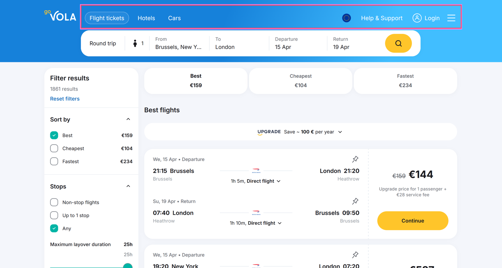
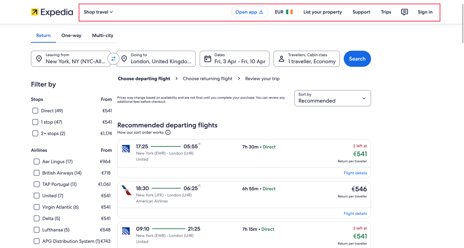
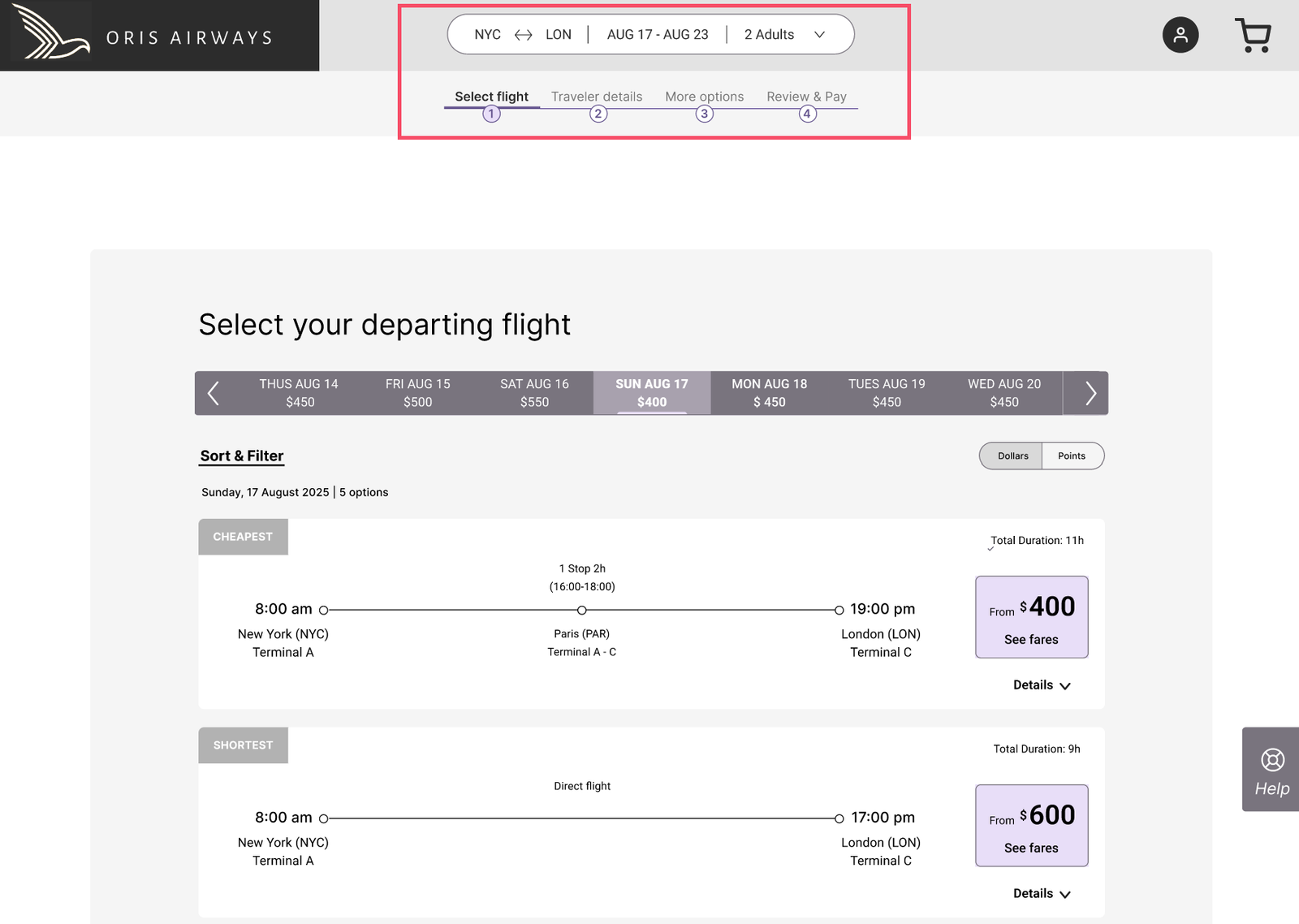
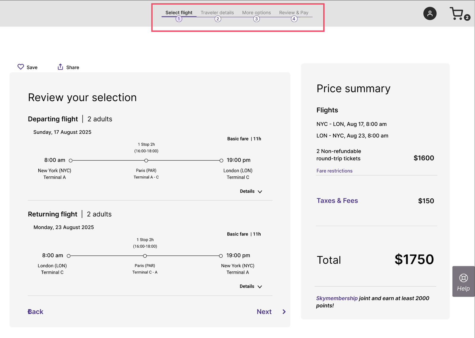
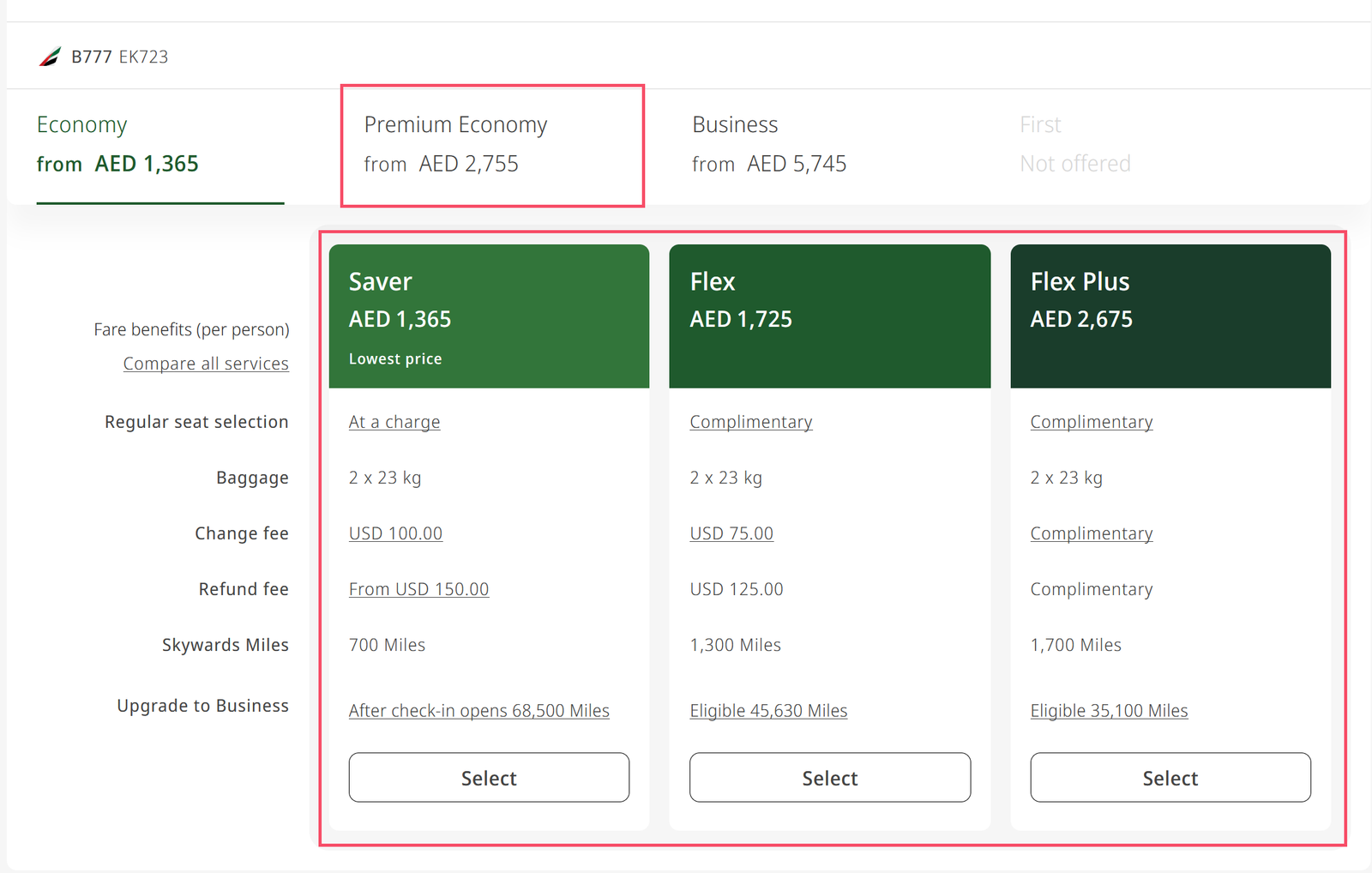
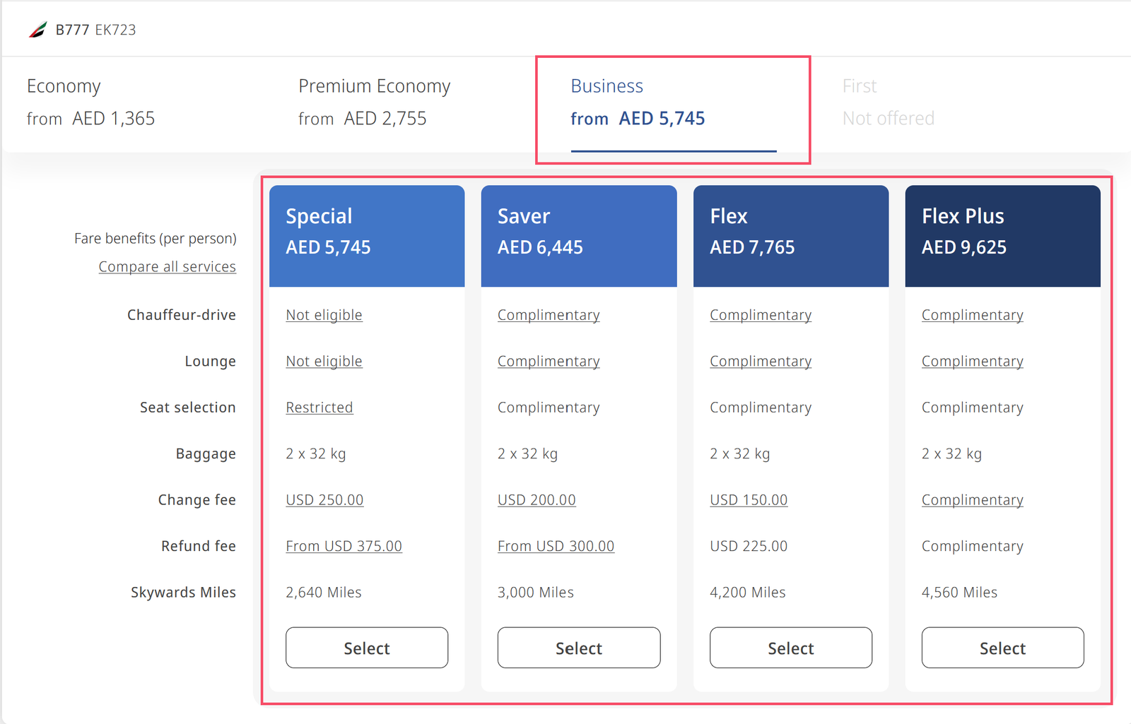
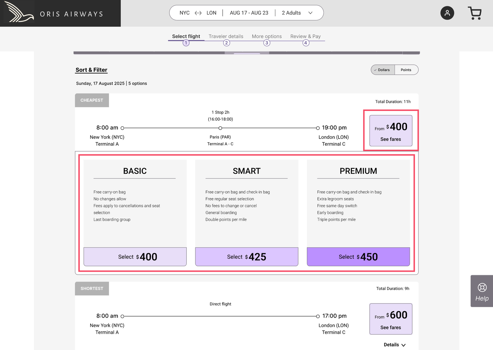
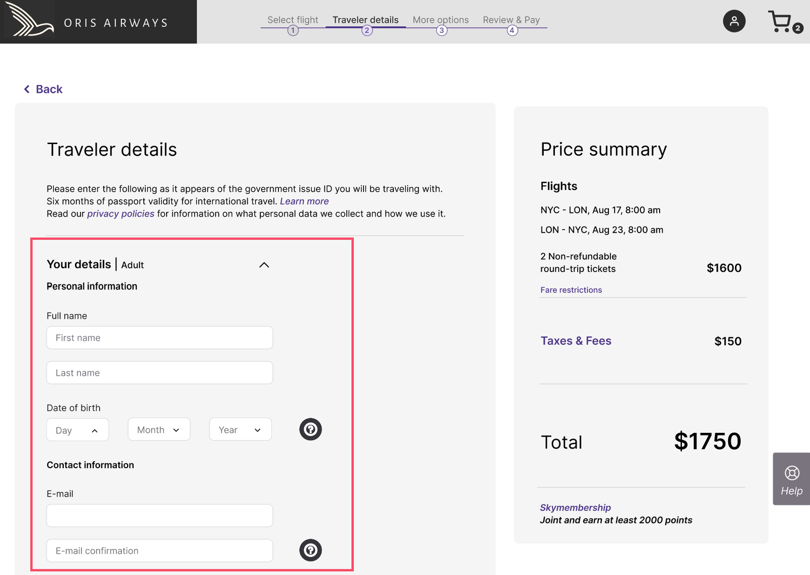
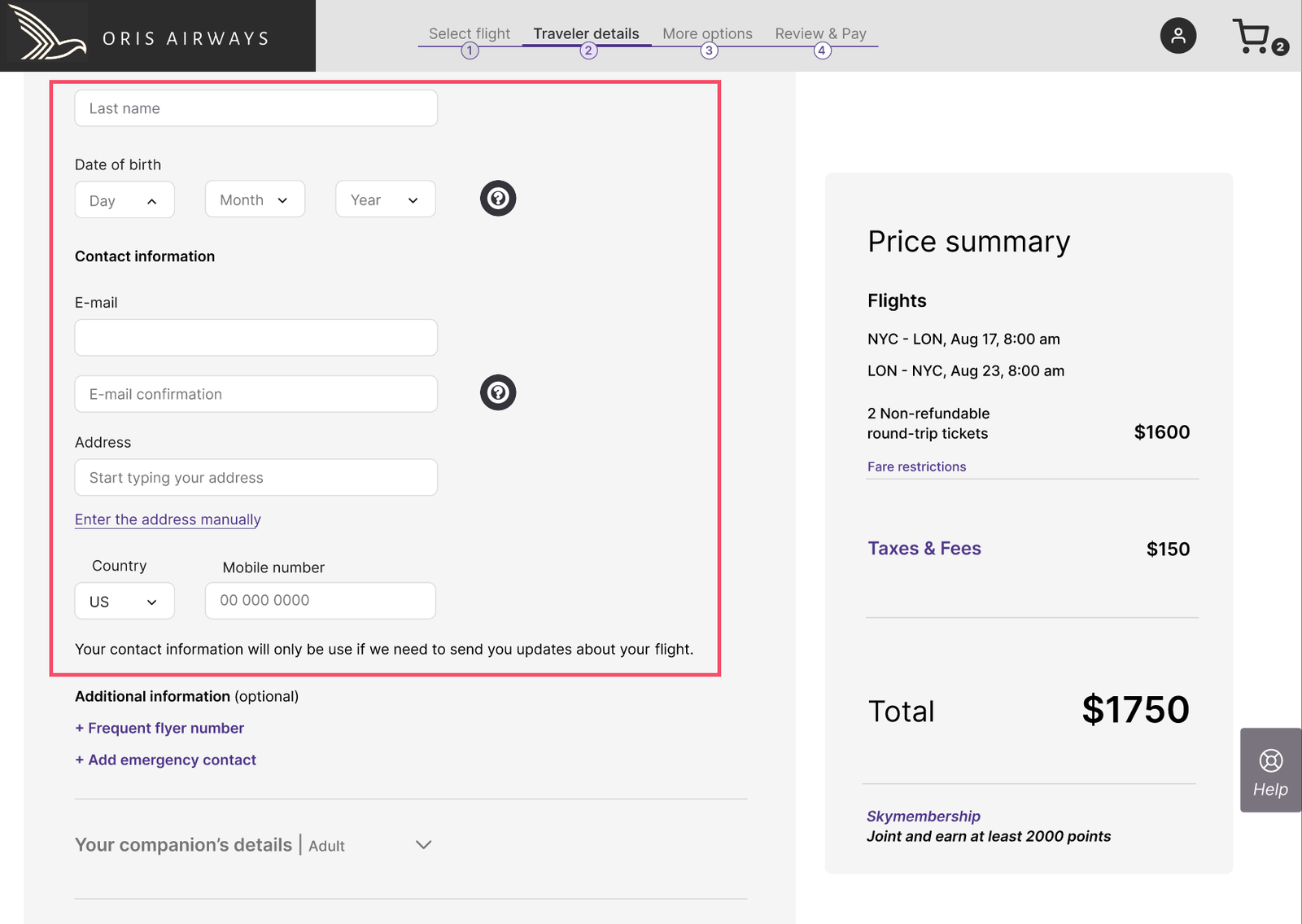
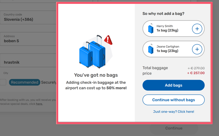
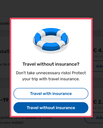
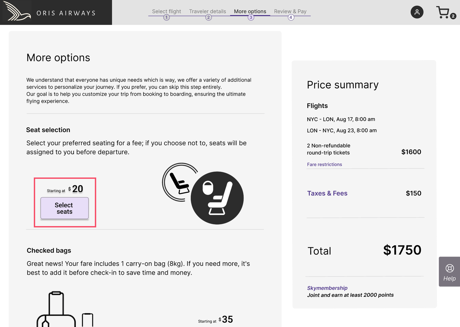
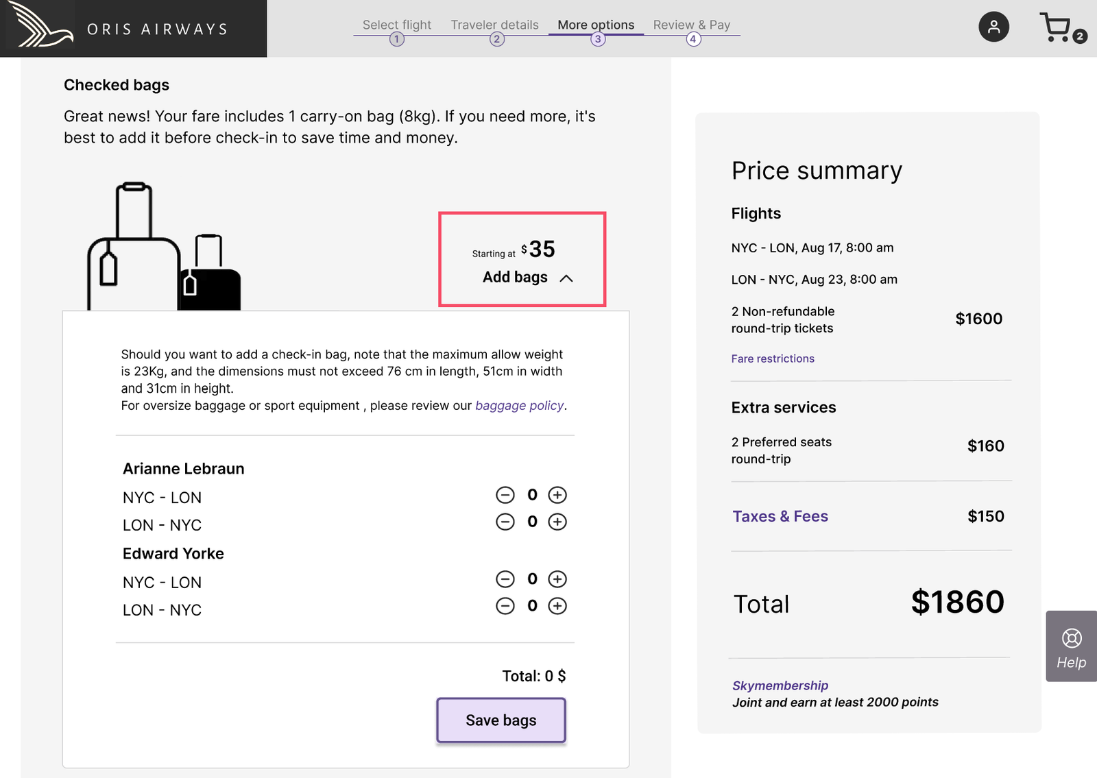
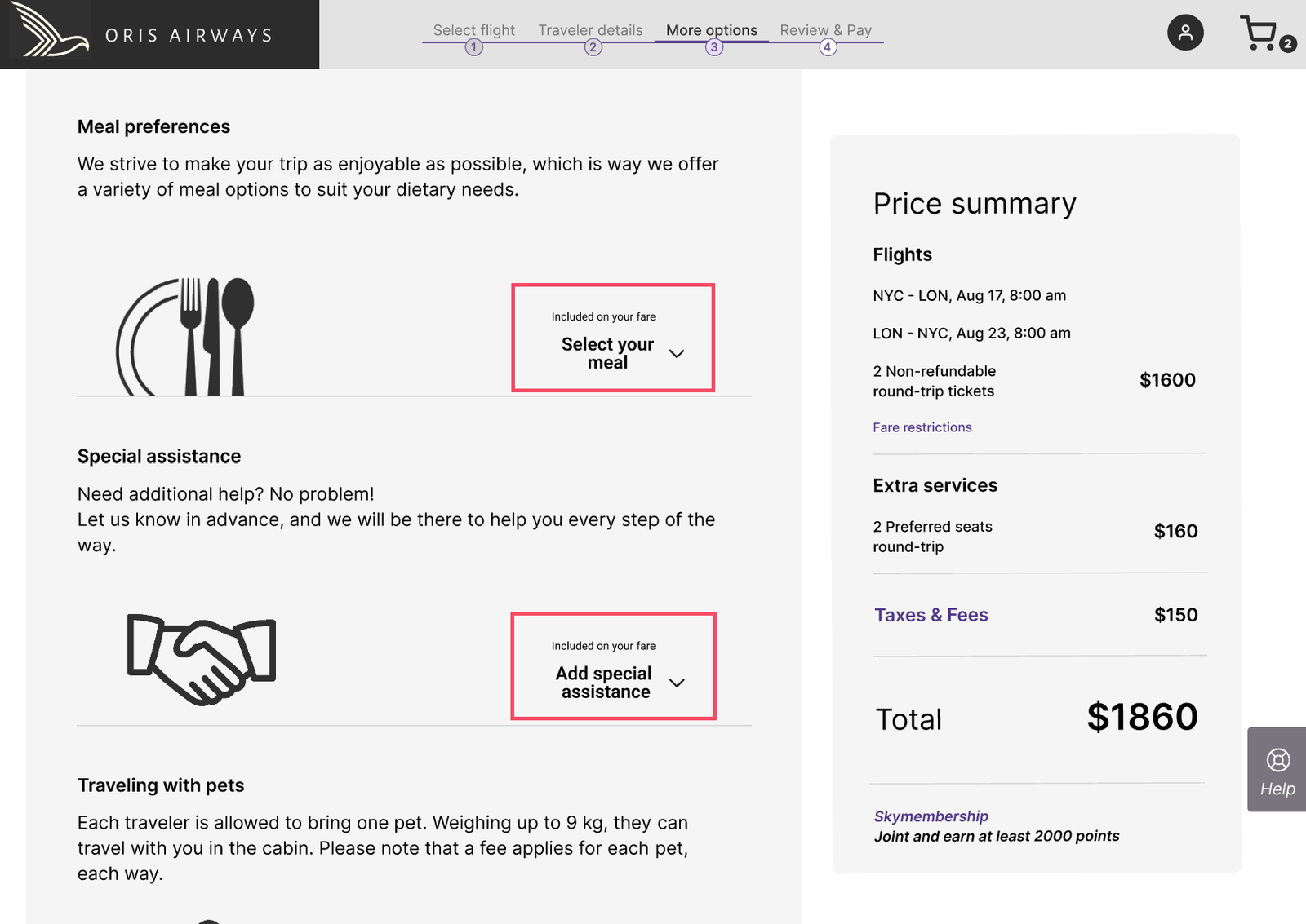
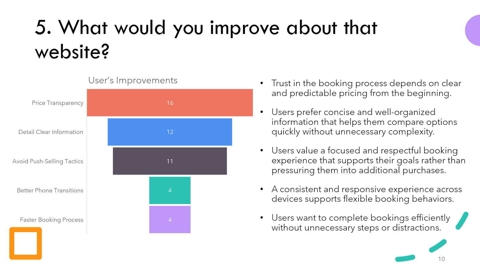
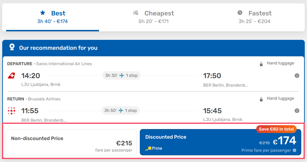
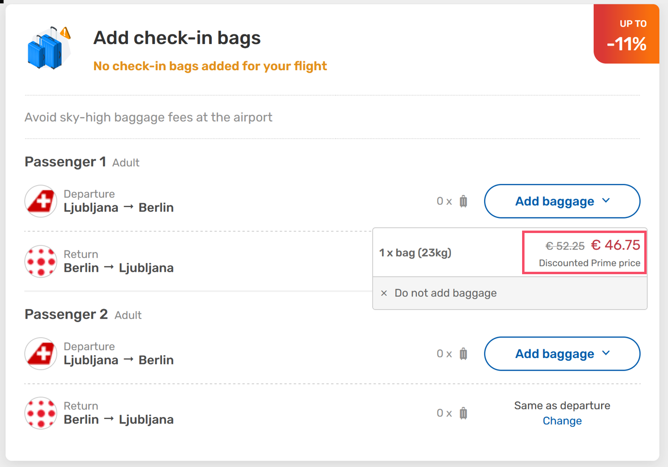
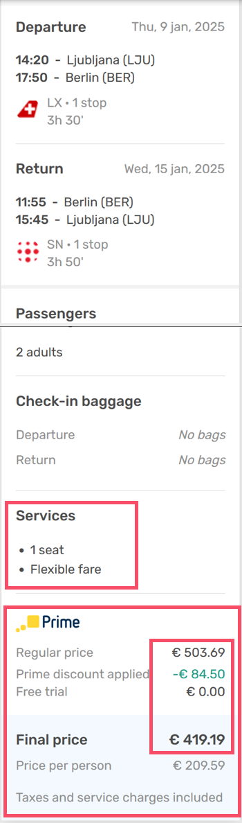
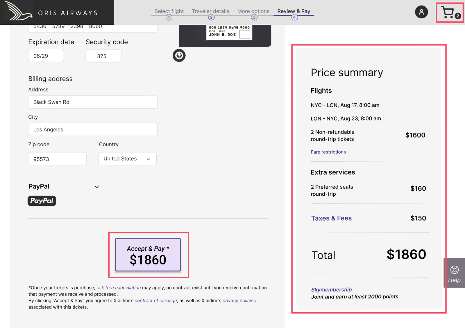
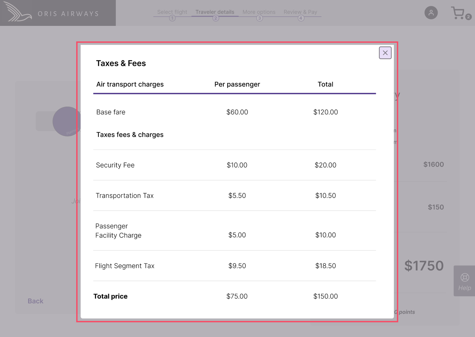
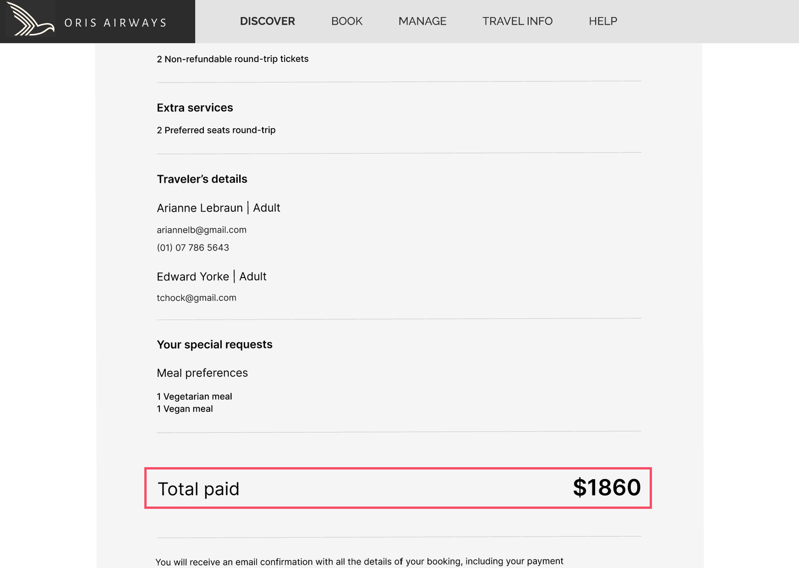
A clear story emerged: the interface, not the users, was creating friction. Unclear error messages, invalid input fields, crowded layouts, too many choices, and aggressive upselling repeatedly disrupted flow. Confusing pricing further eroded trust. These issues highlighted a single underlying need: clarity, guidance, and restraint at every step.
Key UX metrics were tracked to measure impact: task completion time, satisfaction, success rate, error frequency, perceived ease of use, and trust in pricing. Median times were reported to avoid outlier distortion, and satisfaction averaged across participants. Competing platforms scored 2.8/5, while the redesigned prototype reached 4.25/5, a substantial boost in usability and confidence.
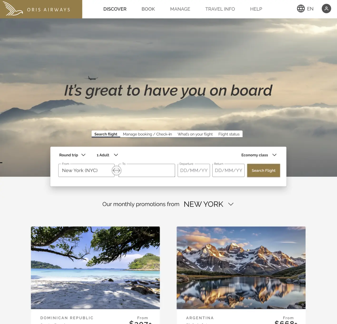
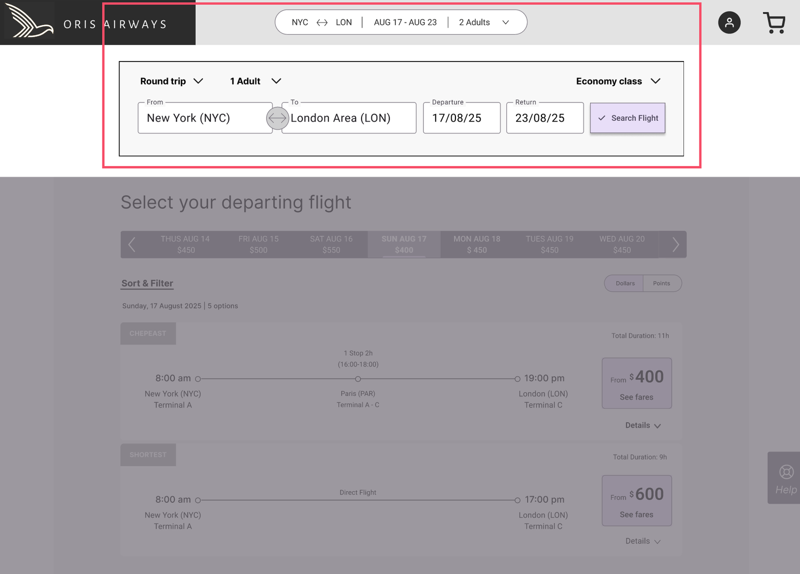
Surveys showed most users book flights on desktop, prioritizing price, date, and airline comparisons. This informed a desktop-first approach, focusing on a clear, efficient search experience. Competitive analysis reinforced the insight that when constraints are clearly communicated and paired with guidance, even complex journeys like flight booking can feel calm, intuitive, and effortless.
From Insight to Solution
Usability testing revealed that users approached the booking process with a clear goal: complete the reservation quickly and without distraction. The following design decisions were implemented to support this behavior and reduce friction throughout the flow.
01. Distractions in the Booking Flow
During usability testing, participants followed the booking steps carefully, rarely using the global navigation. Yet 7% of total confusions occurred at this stage, and two out of three experienced distractions, increasing the risk of accidental exits.
The persistent navigation, intended to encourage exploration, clashed with the highly goal-oriented nature of booking. Instead of helping, it added unnecessary cognitive load, pulling attention away from completing the core task.
“Now, I try to avoid distractions and focus on choosing the right flight.”
Participant 3 - Usability Test
Simplifying Navigation to Maintain Focus
To keep the booking flow goal-oriented, the global navigation was removed once the process began. It was replaced with a compact search summary, letting travelers make quick adjustments without distraction. After flights were selected, only a progress bar remained, clearly showing all steps and the current position in the journey.
This approach eliminated confusion, reduced cognitive load, and kept attention on the booking task. When promoting additional services, such as car rentals or accommodations is needed, options can appear at the right moment, after flights and add-ons are selected, ensuring they feel helpful rather than intrusive, balancing user needs with business priorities.
Compact search summary for trip adjustments
Clear booking progress for a focused booking journey
02. Complex Decisions Were Presented All at Once
Usability testing showed that during the flight selection stages, users were required to re-select flights class and then fare types in the same step, producing confusion and forcing them to process too much information at once. This cognitive overload slowed decision-making and accounted for around 40% of all confusion during testing, making the booking process feel frustrating, overwhelming, and harder to complete with confidence.
"This is where they get you.”
Participant 1 - Usability Test
“I did not realize that you have these three different options within the economy.”
Participant 3 - Usability Test
Breaking Down Complex Decisions
To reduce cognitive overload, flight class and fare selection were separated into two sequential steps. Travelers first choose their preferred class in the core search. Once a flight is selected, they compare available fare options within that class.
This step-by-step structure lets users focus on one decision at a time. If needed, they can adjust their class via the accessible search summary, though testing showed this was rare.
Guiding decisions sequentially prevents second-guessing and avoids overwhelming users with too many options. The result: cognitive load dropped, confusion disappeared, and median task completion time fell from 4:06 to 2:35 minutes, making the booking experience smoother, clearer, and more confident.
Compare fares within class
One decision at a time
Editable search summary
Quick trip adjustments
03. Form Structure Did Not Match User Expectations
The sequence of passenger and contact fields didn’t match travelers’ natural mental model, causing hesitation and small breaks in momentum. Users often paused to figure out what information was expected next and sometimes backtracked to confirm entries.
Paper prototyping highlighted these moments of uncertainty. Misaligned field order and data types disrupted the flow, increasing the risk of form abandonment and slowing completion, the current median task time was 3:20 minutes.
"I'm not sure if mine or hers.”
Participant 2 - Usability Test
Aligning Form Structure with User Expectations
Initially, contact information was placed after all passenger details, a common industry pattern, but testing revealed this confused users about whose details to enter.
The section was moved directly after the primary passenger’s information, aligning with the natural mental model: the main passenger is typically responsible for booking and communication.
This simple change created a logical sequence, reducing hesitation and backtracking. Task completion time dropped from 3:20 to 2:40 minutes, resulting in a smoother, clearer, and more confident booking flow.
Issue identified during early paper prototyping sessions
Contact details placed after the primary passenger to match the booking responsibility
04. Too Many Options Created Cognitive Overload
During add-ons selection, travelers often hesitated. Optional extras like baggage, seats, and meals were presented alongside up-selling pop-ups, creating visual clutter and cognitive overload.
Survey data confirmed this was a pain point, ranking up-selling tactics as the third most important improvement for flight booking sites. Users frequently paused to reassess choices or attempted to skip information, disrupting the booking flow and making the step feel overwhelming and intrusive.
Managing Complexity with Progressive Disclosure
Optional extras like baggage, seat selection, and meals were redesigned as collapsible sections. Using progressive disclosure, these options stayed hidden until travelers chose to expand them, or skip them completely, reducing visual clutter, giving them control, and letting users focus on completing their booking.
Surprisingly, this approach also encouraged exploration, because choices no longer felt overwhelming, users were more willing to review add-ons they initially skipped, making decisions more informed and confident.
Additional offers, such as travel-related up-sells, can appear as optional steps, only after add-ons are complete. This timing ensures they feel relevant rather than intrusive, balancing user needs with business goals.
Choose or skip add-ons
Expand to view options
Optional extras
05. Pricing Was Not Transparent Enough
Price transparency was a major pain point. Interviews and surveys confirmed it as the top improvement users expected from flight booking sites.
Travelers struggled to understand how add-ons, baggage, seat selection, meals, affected the final cost. Promotional prices were often visually emphasized, while the true total appeared smaller or later in the flow. Unexpected taxes or fees sometimes showed up at the final checkout stage, leaving users unsure why the total had increased.
The result: hesitation, reduced trust, and uncertainty about whether they were seeing the correct price, undermining confidence during checkout.
Optional services are listed by name without showing individual prices, so users can’t easily see how each choice affects the total.
Although the discount was declined multiple times, the final total still highlighted the discounted price, giving the impression the cost was lower than it actually was.
Improving Price Transparency
A persistent price summary was added, updating in real time from flight selection through payment so travelers always saw the total cost.
A shopping cart allowed users to review flights and add-ons in one place, with saved selections for signed-in users to continue later without losing progress. A clear link provided a detailed breakdown of fees and taxes, while call-to-action buttons displayed the amount to be charged, reinforcing clarity at each step.
After payment, a confirmation screen summarized the total and all selected services, giving users a complete record.
These changes made pricing visible, understandable, and consistent throughout the booking flow. Trust improved, hesitation decreased, and overall satisfaction rose from 2.8/5 to 4.25/5, with participants praising the clearer pricing and persistent summary as a major improvement.
"The breakdown really help me understand the charges; I won’t be surprised at the end.”
Participant 2 - Usability Test Redesign
The Shift
Early testing revealed a fragmented booking experience: users rated competitor journeys 2.8/5, encountering 15 moments of confusion across five stages and 3 critical mistakes during flight search, fare selection, and add-ons. The process felt overwhelming and unclear.
After redesign and prototype testing, satisfaction rose to 4.25/5, while observed confusion dropped from 15 to 3 moments, an 80% improvement in usability with zero critical mistakes. The remaining confusion occurred during traveler information, highlighting a further improvement opportunity.
Users cited clarity, step-by-step guidance, and transparent pricing as key factors driving satisfaction.
What once felt chaotic became structured.
What once felt uncertain became guided.
The booking journey transformed from something users had to figure out into something that simply made sense, clearer, calmer, and more trustworthy.
User Satisfaction
In Task Confusion
Booking Errors
Key Learnings & Takeaways
This project reinforced how important it is to define clear research goals and success criteria from the beginning. Doing so created a framework that made testing meaningful and ensured design decisions were grounded in evidence rather than assumptions.
Another key insight was the value of collaborative sense-making. Interpreting research with other designers helped challenge assumptions, clarify patterns, and turn complex data into actionable insights.
Throughout the project, the user flow diagram became a guiding tool, helping maintain coherence in the experience and supporting decisions whenever the design direction felt uncertain.
Finally, working through progressive prototyping, from sketches to wireframes to interactive prototypes, allowed problems to surface early, reducing risk and improving confidence in the final design.
This project also highlighted the importance of documenting the design process, not just the final outcome, since early sketches and prototypes often contain the thinking that shapes the final solution.
MORE PROJECTS
